
Draw a vertical line in color on a graph
Solved
regul
Posted messages
94
Status
Membre
-
regul Posted messages 94 Status Membre -
regul Posted messages 94 Status Membre -
Hello, Ladies and Gentlemen and Tontong,
I still need your help to refine things a bit more. Would it be possible to draw vertical colored lines on my chart? Thank you very much for your assistance!
Here is the link
Best regards
https://www.cjoint.com/c/LCepuZzH63W
Configuration: Windows / Chrome 99.0.4844.51
I still need your help to refine things a bit more. Would it be possible to draw vertical colored lines on my chart? Thank you very much for your assistance!
Here is the link
Best regards
https://www.cjoint.com/c/LCepuZzH63W
Configuration: Windows / Chrome 99.0.4844.51
22 réponses
- 1
- 2
Suivant
Hello,
We can add a series y=0.1 only to the dates where we want vertical lines.
We then put error bars on this "positive" series 12.9; negative 0.1. (Insert error bars).
We can add a series y=0.1 only to the dates where we want vertical lines.
We then put error bars on this "positive" series 12.9; negative 0.1. (Insert error bars).

Hello.
It's not easy to help you when you're only sending an image instead of your Calc file!
The simplest thing is to insert rows where you need them.
--
Retirement is nice! Especially in the Caribbean...
Raymond (INSA, AFPA)
It's not easy to help you when you're only sending an image instead of your Calc file!
The simplest thing is to insert rows where you need them.
--
Retirement is nice! Especially in the Caribbean...
Raymond (INSA, AFPA)
Hello Raymond, thank you for the response. Here is my graph!!!
Best regards
https://www.cjoint.com/doc/22_03/LCeqff1HyMW_CR-Dr-Ades-Octobre-21-a-Jan-2022.ods
Best regards
https://www.cjoint.com/doc/22_03/LCeqff1HyMW_CR-Dr-Ades-Octobre-21-a-Jan-2022.ods
When I try to open your link, I only get the message "404 Not Found" ...
--
Retirement is nice! Especially in the Antilles...
Raymond (INSA, AFPA)
--
Retirement is nice! Especially in the Antilles...
Raymond (INSA, AFPA)
Good evening to both of you.
Another method:
Add a series with the value 13 only on the dates where you want vertical lines, and assign it the type Histogram (Columns).
[ Example created with Excel, as I'm not familiar with Calc ]
Best regards.
Retirement is great! Especially in the Caribbean...
Raymond (INSA, AFPA)
Thank you very much Raymond, it's exactly what I wanted, now it's up to me to get to work!!!!
Have a great weekend in your islands!!!
Have a great weekend in your islands!!!
Hello regul.
I appreciate your appreciation. I tried with Calc, but without success: I can't manage to make 2 types of charts coexist, even with the secondary axis enabled.
I would like to ask for help from those who regularly use Calc and its charts; thank you in advance.
--
Retirement is nice! Especially in the Caribbean...
Raymond (INSA, AFPA)

Hello Raymond
I also didn't manage well with Open Office Calc (LibreOffice?)
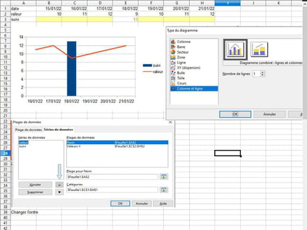
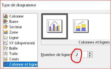
Apparently, to mix graph types, you need to choose a type of diagram with Columns and Lines
and change the series order to have the line where you want.
Example with a new graph but couldn't manage with the regul graph
I also didn't manage well with Open Office Calc (LibreOffice?)
Apparently, to mix graph types, you need to choose a type of diagram with Columns and Lines
and change the series order to have the line where you want.
Example with a new graph but couldn't manage with the regul graph

Hello everyone (I hadn’t noticed that Yclic was also here) thank you for racking your brains to solve my issue.
I’ll keep you updated if a solution works as I haven’t started yet. Have a great weekend
best regards Regul
I will mark it as RESOLVED, I will come back if I have a problem.
I’ll keep you updated if a solution works as I haven’t started yet. Have a great weekend
best regards Regul
I will mark it as RESOLVED, I will come back if I have a problem.
Good evening everyone,
The solution I mentioned with the error bars can definitely be improved.
If a more detailed explanation is needed, let me know, I will do my best.
The solution I mentioned with the error bars can definitely be improved.
If a more detailed explanation is needed, let me know, I will do my best.
Hello everyone.
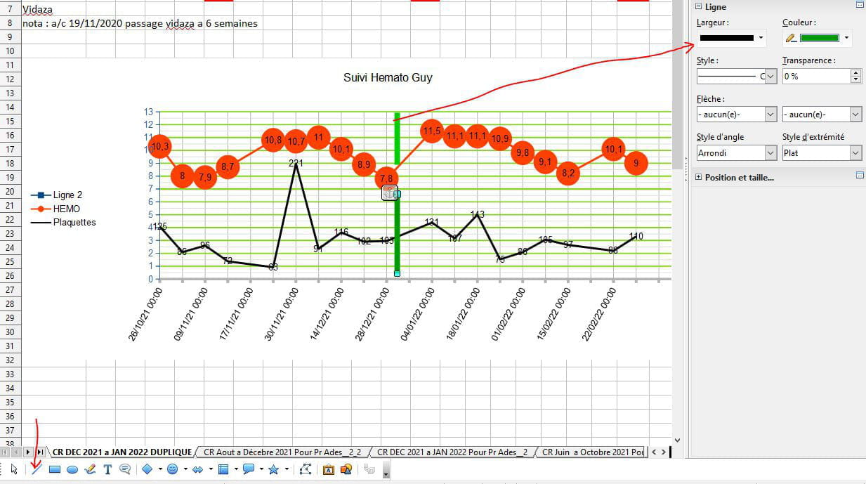
First, I want to thank regul for giving me the opportunity to dive back into Calc and its graphs, and yclick who pointed me in the right direction.
After long and tedious trials and errors, I finally achieved the desired result:
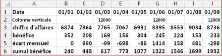
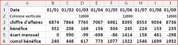
- Use row 2 to enter the value 13 on the desired dates (B2; I2)
- Activate the chart area
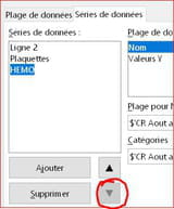
- In [ Data ranges ], left panel, move the HEMO series to the last position
- In [ Chart type ], replace Line with Column and line and choose
To refine the work:
- change the color of the columns
- for the 2 series in line, in [ Format selection ], check the option "Continue the curve". - - - - - - - - - - - https://www.cjoint.com/c/LCgakMPDwFu
--
Retirement is great! Especially in the Caribbean...
Raymond (INSA, AFPA)
First, I want to thank regul for giving me the opportunity to dive back into Calc and its graphs, and yclick who pointed me in the right direction.
After long and tedious trials and errors, I finally achieved the desired result:
- Use row 2 to enter the value 13 on the desired dates (B2; I2)
- Activate the chart area
- In [ Data ranges ], left panel, move the HEMO series to the last position
- In [ Chart type ], replace Line with Column and line and choose
2lines
To refine the work:
- change the color of the columns
- for the 2 series in line, in [ Format selection ], check the option "Continue the curve". - - - - - - - - - - - https://www.cjoint.com/c/LCgakMPDwFu
--
Retirement is great! Especially in the Caribbean...
Raymond (INSA, AFPA)
Hello Raymond, Yclic and everyone
Raymond: on one hand I'm sorry for the trouble I've caused you, but on the other hand I'm pleased that you were able to solve my problem, which might be helpful to the community. That's exactly the effect I was looking for!!!
That being said: you know my neurons fade quickly at my age and I just need a little tutorial to help me add this line 2 (I don't know how to do that) because I might need to create a new chart for the upcoming months!!.
-Currently, from your chart I have no problem adding a column on a chosen date. Changing the color I haven't tried, but it might not always work if I delete elements to add new ones in order to keep the basis of this chart... (I think you follow me in my explanations!!!
Thank you very much and don't rush on the tutorial, there's no urgency "since retirement is nice... in the Caribbean"
Given the time difference, enjoy your meal!!!
Hi, regul.
No need to panic:
You therefore have all the elements to work in peace...
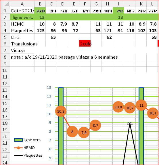
You should even, without waiting any longer, create a new table (10 columns and 8 rows) and insert another chart with 4 vertical bars, and send us the result.
If it's convenient for you, here's a table you could use to create a new chart:
--
Retirement is great! Especially in the Caribbean...
Raymond (INSA, AFPA)
No need to panic:
- Line 2? It already exists in your file, and luckily it's empty; so just enter the 2 values 13 (By the way, I clearly indicated to "use" and not "add" line 2...)!
- Change the color? It's just a click with the Format tool!
- Delete elements? No reason to: You enter your data table without forgetting the line that will serve for the vertical columns, and you strictly follow the tutorial that is post #13.
You therefore have all the elements to work in peace...
You should even, without waiting any longer, create a new table (10 columns and 8 rows) and insert another chart with 4 vertical bars, and send us the result.
If it's convenient for you, here's a table you could use to create a new chart:
--
Retirement is great! Especially in the Caribbean...
Raymond (INSA, AFPA)
Hello,
In an old file (see the last tabs), I added a few images that illustrate Raymond's solution and mine.
This is not a complete tutorial, but if it can shed some light and be helpful...
https://www.cjoint.com/c/LCim3dICp4m
In an old file (see the last tabs), I added a few images that illustrate Raymond's solution and mine.
This is not a complete tutorial, but if it can shed some light and be helpful...
https://www.cjoint.com/c/LCim3dICp4m
Hello TongTong, I hope you are doing well. I still need your services. I reached out on CCM but didn't get the right answer.
So, when I try to print my graph, a different page comes up and I can't retrieve my graph even in "preview." If I take the old graphs, there are no issues with printing, so I don't know what could have happened.
Best regards. Here is the link
https://www.cjoint.com/doc/22_05/LExrByDAf3W_New-CR-Mars-2022-a-Juin-22.ods
- 1
- 2
Suivant