Sorted chart by values
Abitbola
-
Raymond PENTIER Posted messages 58211 Registration date Status Contributor Last intervention -
Raymond PENTIER Posted messages 58211 Registration date Status Contributor Last intervention -
Hello everyone,
sorry if my title is not very informative.
I have a notes file (LibreOffice Calc) with students' scores for an exam. There is one student per line.
I would like to create a bar chart where, on the x-axis, I have the scores, and on the y-axis, the number of students who received that score.
But when I do the simple manipulation to get a graph, I have the students on the x-axis and their scores on the y-axis (which, of course, is not what I'm interested in). How can I do this?
I thought I could count, for each integer n, the number of students who scored between n and n+1 and create a graph from that, but that's terrible!
By the way, if you have a convenient way to find out a student's rank in their class (ranked by score, of course)...
2 answers
-
Hello.
You make a copy of the file; you replace the names of the students with Dupont, Durand, etc., and send it to us.
 1) Go to https://www.cjoint.com/
 2) Click on [Browse] to select your file (max 15 MB)
 3) Scroll down to click on the blue button [Create the Cjoint link]
 4) After a few seconds, the second page will appear, with the link in bold; right-click on it and choose "Copy the link"
 5) Return to your discussion on CCM, and in your message, select "Paste".
=>See the guide https://www.commentcamarche.net/faq/29493-utiliser-cjoint-pour-heberger-des-fichiers
There are also:
 1) https://mon-partage.fr/
 2) https://www.transfernow.net/
--
Retirement is great! Especially in the Antilles...
Raymond (INSA, AFPA) -
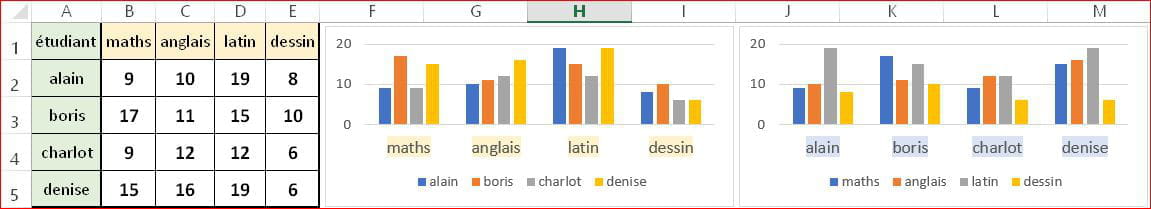
With a table where you have the students in column A, the subjects in row 1, and the grades in the range starting from B2, Excel defaults to a chart with subjects on the x-axis, grades on the y-axis, and several clustered bars for the different students.
By clicking on Switch Row/Column, you get a graph with students on the x-axis, grades on the y-axis, and several clustered bars for the different subjects. To have the grades on the x-axis, you need to create another table, in which the grades (or range of grades) will be in column A.
But I'll wait for your file before going further ...
--
Retirement is great! Especially in the Caribbean ... Raymond (INSA)