Weighted trend by number of data
Solved
fsaner
-
fsaner -
fsaner -
Bonjour,
I want to create a trend line with the data below (X-axis: years, Y-axis: percentages). How can I do this in Excel to take into account the number of data in the 4th column so that my line is influenced more strongly by the percentages with a lot of data (e.g., 7 data points obtained for 2016)
ICT 2010 0% 1
2011 100% 1
2012 100% 1
2013 - 0
2014 100% 2
2015 100% 1
2016 29% 7
2017 50% 2
2018 0% 1
Thank you in advance,
Florian
Configuration: Macintosh / Chrome 67.0.3396.99
I want to create a trend line with the data below (X-axis: years, Y-axis: percentages). How can I do this in Excel to take into account the number of data in the 4th column so that my line is influenced more strongly by the percentages with a lot of data (e.g., 7 data points obtained for 2016)
ICT 2010 0% 1
2011 100% 1
2012 100% 1
2013 - 0
2014 100% 2
2015 100% 1
2016 29% 7
2017 50% 2
2018 0% 1
Thank you in advance,
Florian
Configuration: Macintosh / Chrome 67.0.3396.99
5 answers
-
Hello,
Your problem is not with Excel, but rather of a statistical nature.
How to weight one data point more than another in linear/polynomial regression?
Very simply by breaking down your data:
ICT
2010 0% 1
2011 100% 1
2012 100% 1
2013 - 0
2014 100% 2
2015 100% 1
2016 29% 7
2017 50% 2
2018 0% 1
Becomes
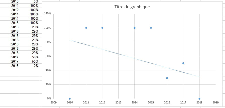
2010 0%
2011 100%
2012 100%
(removal of 2013)
2014 100%
2014 100%
2015 100%
2016 29%
2016 29%
2016 29%
2016 29%
2016 29%
2016 29%
2016 29%
2017 50%
2017 50%
2018 0%

If you remove values from 2016 you will see that the line gently rises.
Best regards. -
Hello,
Thank you for your solution which will help me achieve my goal.
However, I have the following problem: My graph displays 4 values for the year 2016 and also duplicates for the other years. How can I group them to get a single data point per year?
Thank you and have a nice day.
Florian -
In the following column, multiply the % by the quantity.
Insert the chart fromYear 0%
2011 100%
2012 100%
2013 0%
2014 200%
2015 100%
2016 203%
2017 100%
2018 0%
--
It's nice, retirement! Especially in the Caribbean...
Raymond (INSA, AFPA) -
Hello Raymond,
What a chance to be in the Caribbean! :)
Your response is interesting and could perhaps be used as a basis for trend data. However, it does not precisely weigh the values for all cases. Let's imagine that 2017 is 0% with 1 value and 2018 is 0% with 4 values; the multiplication will result in 0 for both 2017 and 2018, and thus my trend will not be more influenced by 2018 than by 2017.
Best regards,
Florian -
Well... I don't know what else to suggest!
You told us " My graph shows 4 values for the year 2016 ... How can I group them to get a single data point per year? ". However, the very first proposal you received met your requirements exactly, with just one point on the graph for 2016!
--
Retirement is great! Especially in the Caribbean...
Raymond (INSA, AFPA)