
Récupérer des données sur une page web
Résolu
vanvan68_0410
Messages postés
13
Date d'inscription
Statut
Membre
Dernière intervention
-
HachadAbderrahmane@gmail.com -
HachadAbderrahmane@gmail.com -
Bonjour à tous,
Je viens vous demander de l'aide.
Je ne connais presque rien a l'html et je veux créer une page sur un site internet du club (via e-monsite)
J'ai récupéré des lignes de code en cherchant sur le net, pour avoir des informations actualisées de balises FFVL (balises météo parapente)
Sur la page que j'ai créée, apparait bien le logo de la balise actualisé mais je ne sais comment faire apparaître les valeurs qui sont données sur le site de la FFVL.
Je vous copie le code que j'ai mis:
<div align="center" style=" float:center; position: relative; margin: 5px;">
<h2><span style="color:#0000CD;"><span style="font-family:times new roman,times,serif;"><em><span style="font-size:24px;">Poët-Laval</span></em></span></span><span style="color:#0000CD;"><span style="font-size:24px;"></span></span><br />
<a href="http://www.balisemeteo.com/balise.php?idBalise=2089" target="_blank"><img alt="" src="http://www.balisemeteo.com/graphs/graph_vent.php?idBalise=2089" width="200" /></a></h2>
</div>
avec le résultat en image:

je souhaite voir apparaitre aussi les valeurs de cette balise N°2089 que l'on peut retrouver sur cette page:
http://www.balisemeteo.com/balise.php?idBalise=2089
Les valeurs que je souhaite récupérer sont: orientation du vent et vitesse du vent et les placer comme indiquées sur l'image, qui provient du site de la FFVL:

Vous pouvez peut-être trouver les valeurs sur cette page aussi:
https://balisemeteo.com/balise_json.php?idBalise=2089
J'espère avoir été assez clair dans mes explications et que quelqu'un pourra m'aider
Dans l'attente d'une réponse, bien cordialement
Yvan
Je viens vous demander de l'aide.
Je ne connais presque rien a l'html et je veux créer une page sur un site internet du club (via e-monsite)
J'ai récupéré des lignes de code en cherchant sur le net, pour avoir des informations actualisées de balises FFVL (balises météo parapente)
Sur la page que j'ai créée, apparait bien le logo de la balise actualisé mais je ne sais comment faire apparaître les valeurs qui sont données sur le site de la FFVL.
Je vous copie le code que j'ai mis:
<div align="center" style=" float:center; position: relative; margin: 5px;">
<h2><span style="color:#0000CD;"><span style="font-family:times new roman,times,serif;"><em><span style="font-size:24px;">Poët-Laval</span></em></span></span><span style="color:#0000CD;"><span style="font-size:24px;"></span></span><br />
<a href="http://www.balisemeteo.com/balise.php?idBalise=2089" target="_blank"><img alt="" src="http://www.balisemeteo.com/graphs/graph_vent.php?idBalise=2089" width="200" /></a></h2>
</div>
avec le résultat en image:
je souhaite voir apparaitre aussi les valeurs de cette balise N°2089 que l'on peut retrouver sur cette page:
http://www.balisemeteo.com/balise.php?idBalise=2089
Les valeurs que je souhaite récupérer sont: orientation du vent et vitesse du vent et les placer comme indiquées sur l'image, qui provient du site de la FFVL:

Vous pouvez peut-être trouver les valeurs sur cette page aussi:
https://balisemeteo.com/balise_json.php?idBalise=2089
J'espère avoir été assez clair dans mes explications et que quelqu'un pourra m'aider
Dans l'attente d'une réponse, bien cordialement
Yvan
21 réponses
- 1
- 2
Suivant
-
@media screen and (min-width: 1044px) {
ici on mets les classes CSS correspondant avec les écrans dont la largeur est comprise
entre 1044px et l'infini
ici le container est de 1023px donc s'affiche correctement car il est inférieure à 1044px
donc il y aura pas de blocs qui s'affichera à l'extérieur de l'écran
}
@media screen and (max-width: 1043px) {
ici on mets les mêmes classes CSS correspondant à une largeur comprise
entre 534px et 1043px
ici le container devient 100% il s'adapte à toute la largeur de l'écran et le bloc à l'intérieur qui est le box
a une largeur de 500px donc il s'affichera correctement entre 534px et 1043px puisque dans cet interval il est plus petit
et ne va pas déborder
}
@media screen and (max-width: 533px) {
ici on mets les mêmes classes CSS correspondant à une largeur comprise
entre 0px et 533px
ici le container reste 100% pour prendre la totalité de la largeur de la page
et le box à l'intérieur du container a une largeur de 325px qui est la largeur minimal d'un téléphone portable
et n'y aura pas de décalage puisque c'est la taille minimal
}
Pour les classes à l'extérieur de ces conditions media query il vont rester les mêmes pour toutes les largeurs du sites
comme par exemple : .red { color: red; } .blue { color: blue; }
Pour que tu puisse voir la largeur de la fenetre en pixel tu inspecte l'élément et tu réduit la fenetre at automatiquement
en haut à droite tu vas voir la largeur en pixel qui change en réduisant la fenêtre du navigateur


Ensuite pour l'affichage de l'heure il faut noter que du moment que c'est fonctionnel sur chromium il n'y a pas de problème au niveau
du code et Dans le navigateur Firefox c'est du soit à la configuration du serveur soit
au protocole https certificat avec des dates de validité qui ne correspondent pas à ce qu’indique l’horloge de votre système
car moi j'ai testé en serveur virtuel local wampserver
Sur Firefox et Chromium il y a pas de décalage donc cela vient du serveur ou est hebergé le site.
Chrome :
Firefox :
-
Mais tu t'en sort pas mal BRAVO
Dans la classe .box ligne 125 mets height:613px; au lieu de height:579px;
Et dit moi -
Super!!!
Bon cette nuit j'ai pensé à cette solution mais je pense que mon cerveau n'en pouvait plus et je ne l'ai pas testé.
je n'ai pas appliqué la valeur de 613px car ça ne suffisait pas sur ma page web, mais j'ai agrandi le box et le cadre des valeurs et j'y ai aussi réduit la marge et tout ça fonctionne parfaitement.
(c'est quand même étrange que je n'ai pas le même rendu que sur une page test locale!!!)
Mille merci pour cette aide précieuse, ça marche à merveille
Je suis ravi!!!
Bravo pour ton super job et ton infinie patience...
MERCI
Yvan -
Bonjour,
pour mettre les données d'un site web sur ton site, ce dernier doit te fournir une API.
C'est bien le cas :
https://federation.ffvl.fr/pages/opendata
Il faut bien sûr lire les conditions avant de pouvoir l'utiliser sur ton site.
Le(s) fichier(s) JSON permettent de traiter cette procédure en renvoyant ces données du serveur à un poste client en utilisant le langage PHP.
Prenant l'exemple de :
La liste des balises météo : https://data.ffvl.fr/json/balises.json
Le fichier JSON est constitué de groupe de code comme ci-dessous (après ouverture du fichier sur ton navigateur) : On prend par exemple idBalise=2091 que toi tu veux
{"idBalise":"2091","nom":"Mont Rachas","latitude":"44.502334","longitude":"5.009848","altitude":"811","departement":"26","remarques":"Balise du Site de Rachas.Orientation Nord et Sud. \r\nAcc\u00e8s en voiture par Le Po\u00ebt-Laval ou \u00e0 pieds par La Roche Saint Secret.","decalageHoraire":"0","struId":"0","station_type":"PIOUPIOU","en_maintenance":"0","url":"http:\/\/www.balisemeteo.com\/balise_mob.php?idBalise=2091","url_histo":"http:\/\/www.balisemeteo.com\/balise_histo_mob.php?idBalise=2091"}
On vas récupérer la liste éléments de idBalise=2091 en utilisant PHP.
Voici le code ci-dessous :
<?php
$json = file_get_contents('http://data.ffvl.fr/json/balises.json');
$data = json_decode($json,true);
/* on parcours la liste des balises pour récupérer les information de la balise 2091 fourni par le fichier JSON */
foreach ($data as $item) {
if($item['idBalise'] == 2091) {
echo 'nom : '.$item['nom'].'<br />';
echo 'latitude : '.$item['latitude'].'<br />';
echo 'longitude : '.$item['longitude'].'<br />';
echo 'altitude : '.$item['altitude'].'<br />';
echo 'departement : '.$item['departement'].'<br />';
echo 'remarques : '.$item['remarques'].'<br />';
echo 'decalageHoraire : '.$item['decalageHoraire'].'<br />';
echo 'struId : '.$item['struId'].'<br />';
echo 'station_type : '.$item['station_type'].'<br />';
echo 'en_maintenance : '.$item['en_maintenance'].'<br />';
echo 'url_histo : '.$item['url_histo'].'<br />';
}
}
?>
On obtient bien les résultats :
Une fois les informations affichés dans ton site il ne te reste plus qu'à faire une page stylé avec de l'HTML et CSS comme on utilise PHP la page doit être nom_de_la_page.php
Voir code ci-dessous d'un exmple de page php utilisant ces résultats :
<!DOCTYPE html>
<html lang="fr">
<head>
<meta http-equiv="Content-Type" content="text/html; charset=UTF-8" />
<style type="text/css">
body{
width:100%;
position:relative;
margin:0;
}
.container{
position:relative;
z-index:1;
width:350px;
margin:auto;
}
.a{
position:absolute;
z-index: 1;
width:350px;
height:360px;
}
.b{
position:absolute;
z-index: 2;
width:350px;
height:360px;
}
.nom{
font-size:33px;
font-weight:bold;
color:red;
padding:5px 5px;
}
.latitude{
font-size:33px;
font-weight:bold;
color:red;
padding:10px 10px;
}
.longitude{
font-size:33px;
font-weight:bold;
color:red;
padding:20px 20px;
}
.departement{
font-size:33px;
font-weight:bold;
color:red;
padding:30px 30px;
}
.url_histo{
font-size:33px;
font-weight:bold;
color:red;
padding:40px 40px;
}
</style>
</head>
<body>
<?php
$json = file_get_contents('http://data.ffvl.fr/json/balises.json');
$data = json_decode($json,true);
/* on parcours la liste des balises pour récupérer les information de la balise 2091 fourni par le fichier JSON */
foreach ($data as $item) {
if($item['idBalise'] == 2091) {
$nom = $item['nom'].'<br />';
$latitude = $item['latitude'].'<br />';
$longitude = $item['longitude'].'<br />';
$altitude = $item['altitude'].'<br />';
$departement = $item['departement'].'<br />';
$remarques = $item['remarques'].'<br />';
$decalageHoraire = $item['decalageHoraire'].'<br />';
$struId = $item['struId'].'<br />';
$station_type = $item['station_type'].'<br />';
$en_maintenance = $item['en_maintenance'].'<br />';
$url_histo = $item['url_histo'].'<br />';
}
}
?>
<div class="container">
<div class="a">
<img src="image.png" width="350" height="360" />
</div>
<div class="b">
<div class="nom"><?php echo $nom; ?></div>
<div class="latitude"><?php echo $latitude; ?></div>
<div class="longitude"><?php echo $longitude; ?></div>
<div class="departement"><?php echo $departement; ?></div>
<div class="url_histo"><a target="_blank" href="<?php echo $url_histo; ?>">Lien</a></div>
</div>
</div>
</body>
</html>
Résultat :
Toi tu veux ca "Les valeurs que je souhaite récupérer sont: orientation du vent et vitesse du vent et les placer comme indiquées sur l'image, qui provient du site de la FFVL:"
Tu dois utilisé cet URL : Les relevés météo (mis à jour toutes les 5 minutes) pour toutes les balises : https://data.ffvl.fr/json/relevesmeteo.json
{"idbalise":"2091","date":"2020-04-12 09:08:05","vitesseVentMoy":"12","vitesseVentMax":"15","vitesseVentMin":"6","directVentMoy":"180","directVentInst":"180","temperature":null,"hydrometrie":null,"pression":null,"luminosite":null,"LUM":null}
Et bien tu fais la même choses voici le code php de la récupération des éléments :
<?php
$json = file_get_contents('http://data.ffvl.fr/json/relevesmeteo.json');
$data = json_decode($json,true);
/* on parcours la liste des balises pour récupérer les information de la balise 2091 fourni par le fichier JSON */
foreach ($data as $item) {
if($item['idbalise'] == 2091) {
echo 'vitesseVentMoy : '.$item['vitesseVentMoy'].'<br />';
echo 'vitesseVentMax : '.$item['vitesseVentMax'].'<br />';
echo 'vitesseVentMin : '.$item['vitesseVentMin'].'<br />';
echo 'directVentMoy : '.$item['directVentMoy'].'<br />';
echo 'directVentInst : '.$item['directVentInst'].'<br />';
}
}
?>
Résultat :
Fait attention ici pour ce fichier JSON dans idbalise le b de balise est en minuscule pour ne pas avoir de BUG.
Bon courage Fréro -
Vous n’avez pas trouvé la réponse que vous recherchez ?
Posez votre question -
Bonjour Anis-web.
Tout d'abord merci pour ton aide et cette solution que je vais étudier.
En parallèle j'avais fait une demande sur un autre forum et grâce à l'aide d'un gars formidable nous avons bien avancé sur mon projet.
Il a réussi a presque satisfaire toute mes demandes et il bloque un peu sur la mise en forme des données sur la page.
Pour l'instant il a réussi à me proposer des modules qui se présentent les uns en dessous des autres et moi je souhaitais pour avoir une page un peu plus compacte, les modules côte à côte par 3.
Ce qui aurait donné 3 X 3 car j'ai pour l'instant 9 modules à afficher.
Si tu veux bien m'aider à finir cette mise en forme je peux te faire suivre le code que cette personne à encodé.
Dans l'attente je jette un oeil à ce que tu m'as proposé et si tu veux on se recontacte.
Je surveillerais ce forum.
Je te met une image de ce que je souhaite faire.
Encore merci,
Cordialement
Yvan

-
sauf erreur 430px
.box {
    width: 430px;
    border: 4px solid rgb(50, 205, 50);
    border-radius: 10px;
    padding-bottom: 0px;
    display : table;
                margin : 0 auto;
    margin-top: 30px;
   }
seulement je ne sais pas comment c'est affiché, je pense que ca vient de ces lignes ici..
   const getLinksData = function () {

    const LinksData = [

     [ "2071", "Léoncel", "261630" ],
     [ "156", "Les Limouches", "262320" ],
     [ "51", "Roynac", "262870" ],
     [ "28", "St-Jean-en-Royans", "263070" ],
     [ "2169", "Lesches-en-Diois", "261640" ],
     [ "33", "Luc-en-Diois", "261670" ],
     [ "2168", "Solaure", "262050" ],
     [ "105", "Montagne de Ruy-Vesc", "263730" ],
     [ "2089", "Le Poët-Laval", "262430" ]

    ];

    return LinksData;

   };

  </script>

  <style>

   body {
    margin: 0;
    padding: 0;
    text-align: center;
   }

   .box {
    width: 430px;
    border: 4px solid rgb(50, 205, 50);
    border-radius: 10px;
    padding-bottom: 0px;
    display : table;
                margin : 0 auto;
    margin-top: 30px;
   }

   .date { margin-top: 10px; }

   .left {
    width: 200px;
    height: 200px;
    border: solid 2px gray;
    border-radius: 6px;
    float: left;
    margin-left: 8px;
   }

   .first {
                    font-size: 22px;
                    margin-top: 20px;
            }

   .name {
    font-size: 28px;
    margin-bottom: 6px;
   }

   .red { color: red; }

   .blue { color: blue; }

  </style>

 </head>

 <body>

  <div id="container"></div>

 </body>

</html>-
Premièrement le container doit avoir une largeur (430px * 3) = 1290px
donc :
tu ajoute :
#container{
width: 1290px !important;
}
après tu ajoute simplement float:left et position:relative dans la classe box
.box{
width: 430px;
border: 4px solid rgb(50, 205, 50);
border-radius: 10px;
padding-bottom: 0px;
display : table;
margin : 0 auto;
margin-top: 30px;
float:left;
position:relative;
}
et dit moi...
attention le box a une bordure de 4px border: 4px solid rgb(50, 205, 50);
donc le container doit avoir (430px * 3) + ((4*2) * 3) = 1314px
donc :
#container{
width: 1314px !important;
}
et non pas :
#container{
width: 1290px !important;
}
dit moi si c'est OK
-
-
attention le box a une bordure de 4px border: 4px solid rgb(50, 205, 50);
donc le container doit avoir (430px * 3) + ((4*2) * 3) = 1314px
donc :
#container{
width: 1314px !important;
}
et non pas :
#container{
width: 1290px !important;
}
dit moi si c'est OK
Après si tu veux que le même affichage s'affiche sur tous les appareils sans te casser la tête avec le responsive
tu ajoute cette balise HTML entre les balises head "Méthode ZOOM"
<head>
<meta name="viewport" content="width=1314">
</head>
Et tu teste sur ton mobile et tablette.
Sinon si tu veux faire le responsive tu as le choix tu mets container entre media query
comme ca
@media screen and (min-width: 1314px) {
#container{
width: 1314px !important;
}
}
@media screen and (max-width: 1313px) {
#container{
width: 100% !important;
}
}
Choisit comme tu veux mais si tu utilise cette méthode il faut enlever la balise
<meta name="viewport" content="width=1314">
et mettre à la place
<meta name="viewport" content="width=device-width, initial-scale=1.0">
et vérifie bien si elle existe pour ne pas la mettre deux fois (dans les deux cas) -
Ok ca fonctionne nickel!
par contre les modules sont collés, comment mettre un espace entre chacun horizontalement?
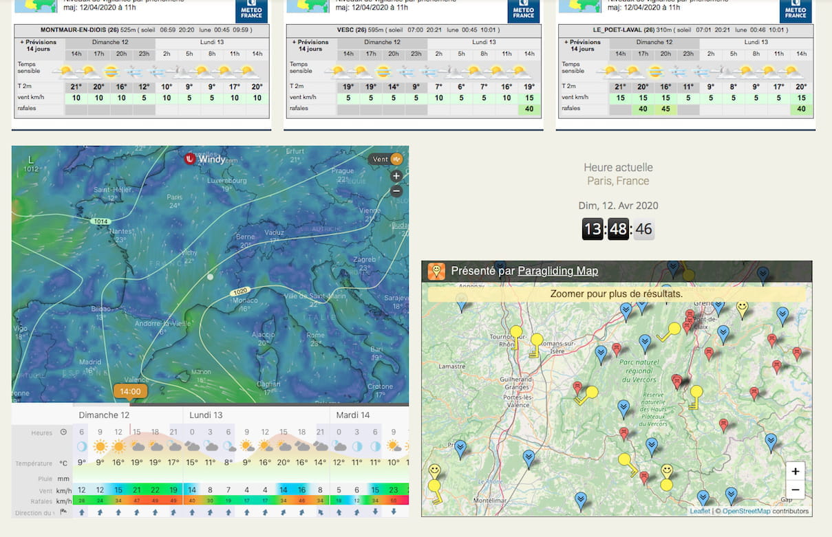
ensuite je veux rajouter 3 widgets en dessous, a la fin suivant cette présentation:
comment les agencer et ou mettre le code?
Dans <body> après <div id="container"></div> ?
ci joint le code des widgets:<iframe width="650" height="610"
src="https://embed.windy.com/embed2.html?lat=42.066&lon=4.878&zoom=5&level=surface&overlay=wind&menu=&message=true&marker=true&calendar=now&pressure=true&type=map&location=coordinates&detail=true&detailLat=44.927&detailLon=4.893&metricWind=km%2Fh&metricTemp=%C2%B0C&radarRange=-1" frameborder="0"></iframe>
<div style="text-align:center;padding:1em 0;">
<h4><a href="https://www.zeitverschiebung.net/fr/city/2988507" style="text-decoration:none;"><span style="color:gray;">Heure actuelle</span><br />
Paris, France</a></h4>
<iframe frameborder="0" height="90" seamless="" src="https://www.zeitverschiebung.net/clock-widget-iframe-v2?language=fr&size=small&timezone=Europe%2FParis" width="100%"></iframe></div>
<p><iframe src="https://www.paraglidingmap.com/thirdpartywidget.aspx?lat=44.91581&lng=5.31986&zoom=9" style="border: 1px solid black; width: 640px; height: 420px;"></iframe></p>
<meta http-equiv="Refresh" content="360">
Super job!!!
merci-
Attention si tu ajoute un espace horizontalement la largeur du container doit augumenter
aussi
dans box on ajoute
margin:30px 5px 0 5px;
et on enlève
margin-top: 30px;
margin : 0 auto;
du coup cela devient
.box{
width: 430px;
border: 4px solid rgb(50, 205, 50);
border-radius: 10px;
padding-bottom: 0px;
display : table;
margin:30px 5px 0 5px;
float:left;
position:relative;
}
et la largeur du container devient (1314px + ((5px + 5px) * 3 )) = 1344px
d'ou :
#container{
width: 1344px !important;
}
donc tu remplace 1314 par 1344px
-
-
tu mets cela à la fin du code du div container
<div id="container">
<!-- a la fin de ton code -->
<!-- ici avant la fermeture du div container-->
<!-- -->
</div>
tu mets ca
<div class="innerbox1">
<h4 style="text-align: center"><a href="https://www.zeitverschiebung.net/fr/city/2988507" style="text-decoration:none;"><span style="color:gray;">Heure actuelle</span><br />
Paris, France</a></h4>
<iframe frameborder="0" height="90" seamless="" src="https://www.zeitverschiebung.net/clock-widget-iframe-v2?language=fr&size=small&timezone=Europe%2FParis" width="100%"></iframe></div>
</div>
<div class="innerbox2">
<div class="box2">
<iframe width="650" height="610" src="https://embed.windy.com/embed2.html?lat=42.066&lon=4.878&zoom=5&level=surface&overlay=wind&menu=&message=true&marker=true&calendar=now&pressure=true&type=map&location=coordinates&detail=true&detailLat=44.927&detailLon=4.893&metricWind=km%2Fh&metricTemp=%C2%B0C&radarRange=-1" frameborder="0"></iframe>
</div>
<div class="box3">
<iframe src="https://www.paraglidingmap.com/thirdpartywidget.aspx?lat=44.91581&lng=5.31986&zoom=9" style="border: 1px solid black; width: 640px; height: 420px;"></iframe>
</div>
</div>
<meta http-equiv="Refresh" content="360">
et tu joute les classes ci-dessous dans le CSS :
.innerbox1{
width:100%;
position:relative;
display:table;
}
.innerbox2{
width:1310px;
position:relative;
display:table;
margin:auto;
}
.box2{
width:650px;
position:relative;
display:table;
float:left;
margin:10px 10px 0 0;
}
.box3{
width:640px;
position:relative;
display:table;
float:left;
margin:10px 0 0 0;
} -
attend je viens de voir la présentation
pour le code du widget tu mets ca
<div class="innerbox1">
<div class="box2">
<iframe width="650" height="610" src="https://embed.windy.com/embed2.html?lat=42.066&lon=4.878&zoom=5&level=surface&overlay=wind&menu=&message=true&marker=true&calendar=now&pressure=true&type=map&location=coordinates&detail=true&detailLat=44.927&detailLon=4.893&metricWind=km%2Fh&metricTemp=%C2%B0C&radarRange=-1" frameborder="0"></iframe>
</div>
<div class="box3">
<h4 style="text-align: center"><a href="https://www.zeitverschiebung.net/fr/city/2988507" style="text-decoration:none;"><span style="color:gray;">Heure actuelle</span><br />
Paris, France</a></h4>
<iframe frameborder="0" height="90" seamless="" src="https://www.zeitverschiebung.net/clock-widget-iframe-v2?language=fr&size=small&timezone=Europe%2FParis" width="100%"></iframe>
<iframe src="https://www.paraglidingmap.com/thirdpartywidget.aspx?lat=44.91581&lng=5.31986&zoom=9" style="border: 1px solid black; width: 640px; height: 420px;"></iframe>
</div>
</div>
<meta http-equiv="Refresh" content="360">
pour le code css tu mets ca
.innerbox1{
width:1310px;
position:relative;
display:table;
margin:auto;
}
.box2{
width:650px;
position:relative;
display:table;
float:left;
margin:10px 10px 0 0;
}
.box3{
width:640px;
position:relative;
display:table;
float:right;
margin:10px 0 0 0;
}
AU LIEU DE CE QUE JE T'AI ENVOYÉ ET DIT MOI SI TOUT ET OK... -
OK OK OK!!!
ca marche super
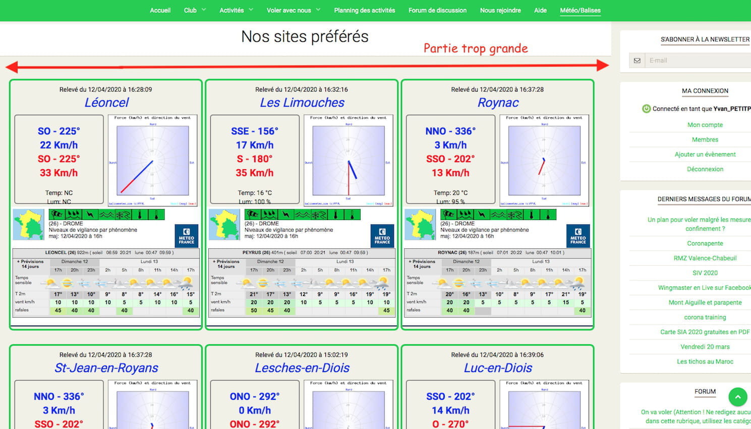
par contre j'ai pas encore bien analysé pour l'affichage sur une tablette ou un mobile mais déjà je vois un léger problème sur un ordi:
Peut-on réduire la totalité de l'emprise de la page car elle met le menu du site (situé à droite) en dehors de l'écran...
Merci

-
Bonjour
ci dessous l'intégralité du code html et css de la page que nous construisons.
merci d'avance...
<!DOCTYPE html>
<html>

 <head>

  <meta http-equiv="Content-Type" content="text/html; charset=utf-8" />

  <script>

   document.addEventListener('DOMContentLoaded', function () {

    getHtmlSource();

   });


   const getHtmlSource = function () {

    let xhr = new XMLHttpRequest();
    xhr.open('GET', 'http://data.ffvl.fr/json/relevesmeteo.json',true);
    xhr.addEventListener('readystatechange', function() {

     if ( xhr.readyState === XMLHttpRequest.DONE && xhr.status === 200 ) {

      const baliseList = JSON.parse(this.response);
      displayBoxes(baliseList);

     }

    });

    xhr.send(null);

   };

   const displayBoxes = function (baliseList) {

    const LinksData = getLinksData();
    const thisContainer = document.getElementById('container');
    thisContainer.innerHTML = ""; // reset

    for ( let idx = 0; idx < LinksData.length; idx++ ) {

     thisNewDiv = document.createElement('div');
     thisNewDiv.className = 'box';
     thisContainer.appendChild(thisNewDiv);

     const baliseInfo = getBaliseInfo(baliseList,LinksData[idx][0],LinksData[idx][1]);

     thisNewDiv.innerHTML += '<div class="date">'+baliseInfo.update+'</div>';
     thisNewDiv.innerHTML += '<div class="name"><span class="blue""><em>' + baliseInfo.name + '</em></span></div>';

     thisNewBorderDiv = document.createElement('div');
     thisNewBorderDiv.className = 'left';
     thisNewDiv.appendChild(thisNewBorderDiv);

     baliseInfo.baliseFound ? displayValues(baliseInfo,thisNewBorderDiv) : displayNotFound(baliseInfo,thisNewBorderDiv);

     let thisGraph = '<a href="http://www.balisemeteo.com/balise.php?idBalise=' + LinksData[idx][0] + '" target="_blank">'
     thisGraph += '<img alt="" src="http://www.balisemeteo.com/graphs/graph_vent.php?idBalise=' + LinksData[idx][0] + '" width="200" /></a>';
     thisNewDiv.innerHTML += '<div id="contain_graph'+LinksData[idx][0]+'" class="right">'+thisGraph+'</div>';
     thisNewDiv.innerHTML += '<div id="contain_meteo'+LinksData[idx][0]+'" class="down"><iframe src="http://www.vigimeteo.com/widget_vigi_dep_s.html?a=' + LinksData[idx][2] + '&b=" width="425" height="268" frameborder="0"></iframe><div>';

    }

   };

   const displayNotFound = function (thisData,thisNewDiv) {

    thisNewDiv.innerHTML += '<div id="divError'+thisData.id+'" class="date"><span class="red">!!! BALISE ' + thisData.name + ' EN MAINTENANCE !!!</span></div>';

   };

   const getBaliseInfo = function (baliseList,thisBalise,thisName) {

    let thisData = {};
    thisData.name = thisName;
    thisData.id = thisBalise;
    thisData.baliseFound = false;

    for ( let i = 0; i < baliseList.length; i++ ) {

     if ( baliseList[i].idbalise == thisBalise ) {

      thisData.date = baliseList[i].date == null ? "NC" : new Date(baliseList[i].date.replace(" ","T")).toLocaleString('fr-FR', { timeZone: 'UTC' });
      thisData.update = getDifferenceDate(baliseList[i].date) > 1800 ? '<img src="http://tiny.cc/zcwjmz" style="width:16px;"></img><i class="red"> Le relevé date de plus de 30mn - ' + thisData.date + '</i>' : 'Relevé du ' + thisData.date;
      thisData.moyenDirection = baliseList[i].directVentMoy == null ? "NC" : getCardinalDirection(baliseList[i].directVentMoy) + ' - ' + baliseList[i].directVentMoy + '°';
      thisData.moyenVitesse = baliseList[i].vitesseVentMoy == null ? "NC" : baliseList[i].vitesseVentMoy + ' Km/h';
      thisData.maxiDirection = baliseList[i].directVentInst == null ? "NC" : getCardinalDirection(baliseList[i].directVentInst) + ' - ' + baliseList[i].directVentInst + '°';
      thisData.maxiVitesse = baliseList[i].vitesseVentMax == null ? "NC" : baliseList[i].vitesseVentMax + ' Km/h';
      thisData.miniVitesse = baliseList[i].vitesseVentMin == null ? "NC" : baliseList[i].vitesseVentMin + ' Km/h';
      thisData.temperature = baliseList[i].temperature == null ? "NC" : baliseList[i].temperature + ' °C';
                        thisData.luminosite = baliseList[i].LUM == null ? "NC" : baliseList[i].LUM + ' %';
      thisData.baliseFound = true;

     }

    }

    return thisData;

   };

   const getCardinalDirection = function (degreeValue) {

    let cardinal = "null";
    const degree = parseInt(degreeValue);

    if ( degree > 348.5 && degree < 11.5 || degree == 0 ) cardinal = 'N';
    if ( degree > 11 && degree < 34 ) cardinal = 'NNE';
    if ( degree > 33.5 && degree < 56.5 ) cardinal = 'NE';
    if ( degree > 56 && degree < 79 ) cardinal = 'ENE';
    if ( degree > 78.5 && degree < 101.5 ) cardinal = 'E';
    if ( degree > 101 && degree < 124 ) cardinal = 'ESE';
    if ( degree > 123.5 && degree < 146.5 ) cardinal = 'SE';
    if ( degree > 146 && degree < 169 ) cardinal = 'SSE';
    if ( degree > 168.5 && degree < 191.5 ) cardinal = 'S';
    if ( degree > 191 && degree < 214 ) cardinal = 'SSO';
    if ( degree > 213.5 && degree < 236.5 ) cardinal = 'SO';
    if ( degree > 236 && degree < 259 ) cardinal = 'OSO';
    if ( degree > 258.5 && degree < 281.5 ) cardinal = 'O';
    if ( degree > 280 && degree < 304 ) cardinal = 'ONO';
    if ( degree > 303.5 && degree < 326.5 ) cardinal = 'NO';
    if ( degree > 326 && degree < 349 ) cardinal = 'NNO';

    return cardinal;

   };

   const getDifferenceDate = function (thisDate) {

    const actualDate = Date.now();
    const baliseDate = Date.parse(thisDate.replace(" ","T"));
    const differenceDate = ( actualDate - baliseDate ) / 1000;
    return differenceDate; // en secondes

   };

   const displayValues = function (thisData,thisNewDiv) {

    thisNewDiv.innerHTML += '<div class="first + blue"><strong><span class="blue">' + thisData.moyenDirection + '</span></div>';
    thisNewDiv.innerHTML += '<div><strong><span class="blue + first">' + thisData.moyenVitesse + '</span></div>';
    thisNewDiv.innerHTML += '<div><strong><span class="red + first">' + thisData.maxiDirection + '</span></div>';
    thisNewDiv.innerHTML += '<div style="height:50px;display:block;"><strong><span class="red + first">' + thisData.maxiVitesse + '</span></div>';

    thisNewDiv.innerHTML += '<div>Temp: ' + thisData.temperature + '</div>';
                thisNewDiv.innerHTML += '<div>Lum: ' + thisData.luminosite + '</div>';

   };

   const getLinksData = function () {

    const LinksData = [

     [ "2071", "Léoncel", "261630" ],
     [ "156", "Les Limouches", "262320" ],
     [ "51", "Roynac", "262870" ],
     [ "28", "St-Jean-en-Royans", "263070" ],
     [ "2169", "Lesches-en-Diois", "261640" ],
     [ "33", "Luc-en-Diois", "261670" ],
     [ "2168", "Solaure", "262050" ],
     [ "105", "Montagne de Ruy-Vesc", "263730" ],
     [ "2089", "Le Poët-Laval", "262430" ]

    ];

    return LinksData;

   };

  </script>

  <style>

   body {
    margin: 0;
    padding: 0;
    text-align: center;
   }

   .box {
    width: 430px;
    border: 4px solid rgb(50, 205, 50);
    border-radius: 10px;
    padding-bottom: 0px;
    display : table;
                margin:30px 4px 0 4px;
    float:left;
    position:relative;
   }

   .date { margin-top: 10px; }

   .left {
    width: 140px;
    height: 200px;
    border: solid 2px gray;
    border-radius: 6px;
    float: left;
    margin-left: 24px;
   }

   .first {
                    font-size: 22px;
                    margin-top: 10px;
            }

   .name {
    font-size: 28px;
    margin-bottom: 6px;
   }

   .red { color: red; }

   .blue { color: blue; }
   #container{
   width: 1344px !important;
   }

            .innerbox1{
                width:1302px;
                position:relative;
                display:table;
                margin:5px;
                float: left;
    position:relative;
            }
            .box2{
                width:650px;
                position:relative;
                display:table;
                float:left;
                margin:10px 10px 0 0;
            }
            .box3{
                width:640px;
                position:relative;
                display:table;
                float:right;
                margin:10px 0 0 0;
            }

  </style>

 </head>

 <body>

        <div id="container"></div>
        <div></div>
        <div class="innerbox1">
            <div class="box2">
            <iframe width="650" height="610" src="https://embed.windy.com/embed2.html?lat=42.066&lon=4.878&zoom=5&level=surface&overlay=wind&menu=&message=true&marker=true&calendar=now&pressure=true&type=map&location=coordinates&detail=true&detailLat=44.927&detailLon=4.893&metricWind=km%2Fh&metricTemp=%C2%B0C&radarRange=-1" frameborder="0"></iframe>
            </div>
            <div class="box3">
            <h4 style="text-align: center"><a href="https://www.zeitverschiebung.net/fr/city/2988507" style="text-decoration:none;"><span style="color:gray;">Heure actuelle</span><br />
            Paris, France</a></h4>
            <iframe frameborder="0" height="90" seamless="" src="https://www.zeitverschiebung.net/clock-widget-iframe-v2?language=fr&size=small&timezone=Europe%2FParis" width="100%"></iframe>
            <iframe src="https://www.paraglidingmap.com/thirdpartywidget.aspx?lat=44.91581&lng=5.31986&zoom=9" style="border: 1px solid black; width: 640px; height: 435px;"></iframe>
            </div>
            </div>
            <meta http-equiv="Refresh" content="360">

 </body>

</html>
D'avance merci
Message modifié par la modération
Pour une lecture plus facile du code, à l'avenir utilisez les balises, VOIR CETTE PAGE -
J'AI RÉDUIT LE container à 1023px
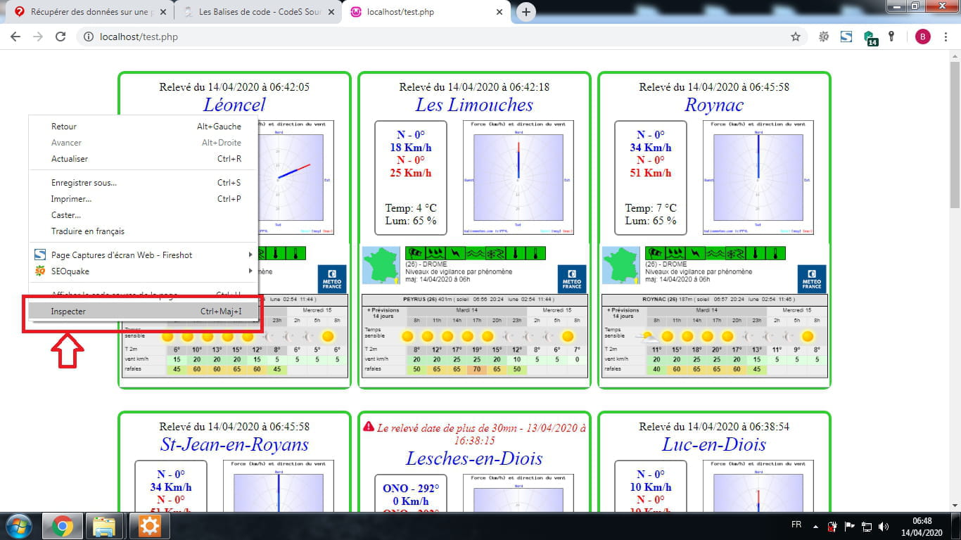
mais il faut modifier la largeur et hauteur de l'iframe des box bpour qu'il n'y ai plus de scroll bar horizontal. Voir si c'est toi qui a accès au code des iframes des 9 box pour modifier la largeur et la hauteur. Et dit moi... -
Bonsoir
j'avais déjà testé de réduire le container ainsi que les box, mais les Iframes sont fournies par météo France et quand je réduis leur taille ça crée un scroll bar en effet...
la ligne qui correspond aux Iframes qui posent problème( ligne 62)thisNewDiv.innerHTML += '<div id="contain_meteo'+LinksData[idx][0]+'" class="down"><iframe src="http://www.vigimeteo.com/widget_vigi_dep_s.html?a=' + LinksData[idx][2] + '&b=" width="425" height="268" frameborder="0"></iframe><div>';
peut-on les réduire sans que ça ne crée de scrollbar?
mettre à l'échelle 0,9 ?
je cherche un peu partout mais pour l'instant je n'ai pas trouvé..
merci! -
C'est bon j'ai trouvé le code était dans le javascript
Voici le code FINALE avec 1023px de container "pour ne plus avoir de problème dans l'affichage du PC"<!DOCTYPE html> <html> <head> <meta http-equiv="Content-Type" content="text/html; charset=utf-8" /> <script> document.addEventListener('DOMContentLoaded', function () { getHtmlSource(); }); const getHtmlSource = function () { let xhr = new XMLHttpRequest(); xhr.open('GET', 'http://data.ffvl.fr/json/relevesmeteo.json',true); xhr.addEventListener('readystatechange', function() { if ( xhr.readyState === XMLHttpRequest.DONE && xhr.status === 200 ) { const baliseList = JSON.parse(this.response); displayBoxes(baliseList); } }); xhr.send(null); }; const displayBoxes = function (baliseList) { const LinksData = getLinksData(); const thisContainer = document.getElementById('container'); thisContainer.innerHTML = ""; // reset for ( let idx = 0; idx < LinksData.length; idx++ ) { thisNewDiv = document.createElement('div'); thisNewDiv.className = 'box'; thisContainer.appendChild(thisNewDiv); const baliseInfo = getBaliseInfo(baliseList,LinksData[idx][0],LinksData[idx][1]); thisNewDiv.innerHTML += '<div class="date">'+baliseInfo.update+'</div>'; thisNewDiv.innerHTML += '<div class="name"><span class="blue""><em>' + baliseInfo.name + '</em></span></div>'; thisNewBorderDiv = document.createElement('div'); thisNewBorderDiv.className = 'left'; thisNewDiv.appendChild(thisNewBorderDiv); baliseInfo.baliseFound ? displayValues(baliseInfo,thisNewBorderDiv) : displayNotFound(baliseInfo,thisNewBorderDiv); let thisGraph = '<a href="http://www.balisemeteo.com/balise.php?idBalise=' + LinksData[idx][0] + '" target="_blank">' thisGraph += '<img alt="" src="http://www.balisemeteo.com/graphs/graph_vent.php?idBalise=' + LinksData[idx][0] + '" width="200" /></a>'; thisNewDiv.innerHTML += '<div id="contain_graph'+LinksData[idx][0]+'" class="right">'+thisGraph+'</div>'; thisNewDiv.innerHTML += '<div id="contain_meteo'+LinksData[idx][0]+'" class="down"><iframe class="boxiframe" src="http://www.vigimeteo.com/widget_vigi_dep_s.html?a=' + LinksData[idx][2] + '&b=" width="325" height="auto" frameborder="0"></iframe><div>'; } }; const displayNotFound = function (thisData,thisNewDiv) { thisNewDiv.innerHTML += '<div id="divError'+thisData.id+'" class="date"><span class="red">!!! BALISE ' + thisData.name + ' EN MAINTENANCE !!!</span></div>'; }; const getBaliseInfo = function (baliseList,thisBalise,thisName) { let thisData = {}; thisData.name = thisName; thisData.id = thisBalise; thisData.baliseFound = false; for ( let i = 0; i < baliseList.length; i++ ) { if ( baliseList[i].idbalise == thisBalise ) { thisData.date = baliseList[i].date == null ? "NC" : new Date(baliseList[i].date.replace(" ","T")).toLocaleString('fr-FR', { timeZone: 'UTC' }); thisData.update = getDifferenceDate(baliseList[i].date) > 1800 ? '<img src="http://tiny.cc/zcwjmz" style="width:16px;"></img><i class="red"> Le relevé date de plus de 30mn - ' + thisData.date + '</i>' : 'Relevé du ' + thisData.date; thisData.moyenDirection = baliseList[i].directVentMoy == null ? "NC" : getCardinalDirection(baliseList[i].directVentMoy) + ' - ' + baliseList[i].directVentMoy + '°'; thisData.moyenVitesse = baliseList[i].vitesseVentMoy == null ? "NC" : baliseList[i].vitesseVentMoy + ' Km/h'; thisData.maxiDirection = baliseList[i].directVentInst == null ? "NC" : getCardinalDirection(baliseList[i].directVentInst) + ' - ' + baliseList[i].directVentInst + '°'; thisData.maxiVitesse = baliseList[i].vitesseVentMax == null ? "NC" : baliseList[i].vitesseVentMax + ' Km/h'; thisData.miniVitesse = baliseList[i].vitesseVentMin == null ? "NC" : baliseList[i].vitesseVentMin + ' Km/h'; thisData.temperature = baliseList[i].temperature == null ? "NC" : baliseList[i].temperature + ' °C'; thisData.luminosite = baliseList[i].LUM == null ? "NC" : baliseList[i].LUM + ' %'; thisData.baliseFound = true; } } return thisData; }; const getCardinalDirection = function (degreeValue) { let cardinal = "null"; const degree = parseInt(degreeValue); if ( degree > 348.5 && degree < 11.5 || degree == 0 ) cardinal = 'N'; if ( degree > 11 && degree < 34 ) cardinal = 'NNE'; if ( degree > 33.5 && degree < 56.5 ) cardinal = 'NE'; if ( degree > 56 && degree < 79 ) cardinal = 'ENE'; if ( degree > 78.5 && degree < 101.5 ) cardinal = 'E'; if ( degree > 101 && degree < 124 ) cardinal = 'ESE'; if ( degree > 123.5 && degree < 146.5 ) cardinal = 'SE'; if ( degree > 146 && degree < 169 ) cardinal = 'SSE'; if ( degree > 168.5 && degree < 191.5 ) cardinal = 'S'; if ( degree > 191 && degree < 214 ) cardinal = 'SSO'; if ( degree > 213.5 && degree < 236.5 ) cardinal = 'SO'; if ( degree > 236 && degree < 259 ) cardinal = 'OSO'; if ( degree > 258.5 && degree < 281.5 ) cardinal = 'O'; if ( degree > 280 && degree < 304 ) cardinal = 'ONO'; if ( degree > 303.5 && degree < 326.5 ) cardinal = 'NO'; if ( degree > 326 && degree < 349 ) cardinal = 'NNO'; return cardinal; }; const getDifferenceDate = function (thisDate) { const actualDate = Date.now(); const baliseDate = Date.parse(thisDate.replace(" ","T")); const differenceDate = ( actualDate - baliseDate ) / 1000; return differenceDate; // en secondes }; const displayValues = function (thisData,thisNewDiv) { thisNewDiv.innerHTML += '<div class="first + blue"><strong><span class="blue">' + thisData.moyenDirection + '</span></div>'; thisNewDiv.innerHTML += '<div><strong><span class="blue + first">' + thisData.moyenVitesse + '</span></div>'; thisNewDiv.innerHTML += '<div><strong><span class="red + first">' + thisData.maxiDirection + '</span></div>'; thisNewDiv.innerHTML += '<div style="height:50px;display:block;"><strong><span class="red + first">' + thisData.maxiVitesse + '</span></div>'; thisNewDiv.innerHTML += '<div>Temp: ' + thisData.temperature + '</div>'; thisNewDiv.innerHTML += '<div>Lum: ' + thisData.luminosite + '</div>'; }; const getLinksData = function () { const LinksData = [ [ "2071", "Léoncel", "261630" ], [ "156", "Les Limouches", "262320" ], [ "51", "Roynac", "262870" ], [ "28", "St-Jean-en-Royans", "263070" ], [ "2169", "Lesches-en-Diois", "261640" ], [ "33", "Luc-en-Diois", "261670" ], [ "2168", "Solaure", "262050" ], [ "105", "Montagne de Ruy-Vesc", "263730" ], [ "2089", "Le Poët-Laval", "262430" ] ]; return LinksData; }; </script> <style> body { margin: 0; padding: 0; text-align: center; } .box { width: 325px; height: 445px; border: 4px solid rgb(50, 205, 50); border-radius: 10px; padding-bottom: 0px; display: table; margin: 30px 4px 0 4px; float: left; position: relative; } .box > div.right{ width:325px !important; } .box > div.right > a > img{ width: 158px !important; } .box > div.down{ width: 325px !important; position: absolute; bottom: 0; height: 234px; } .boxiframe{ transform: scale(0.77); width: 425px; height: 266px; margin: 0 0 0 -50px; } .date { margin-top: 10px; } .left { width: 100px; height: 160px; border: solid 2px gray; border-radius: 6px; float: left; margin-left: 20px; } .first { font-size: 16px; margin-top: 10px; } .name { font-size: 28px; margin-bottom: 6px; } .red { color: red; } .blue { color: blue; } #container{ width: 1023px !important; margin: auto; display: table; } .innerbox1{ width:1023px; position:relative; display:table; margin:auto; position:relative; } .box2{ width:512px; position:relative; display:table; float:left; margin: 37px 10px 0 0; } .box3{ width:490px; position:relative; display:table; float:right; margin:10px 0 0 0; } </style> </head> <body> <div id="container"></div> <div></div> <div class="innerbox1"> <div class="box2"> <iframe width="512" height="480" src="https://embed.windy.com/embed2.html?lat=42.066&lon=4.878&zoom=5&level=surface&overlay=wind&menu=&message=true&marker=true&calendar=now&pressure=true&type=map&location=coordinates&detail=true&detailLat=44.927&detailLon=4.893&metricWind=km%2Fh&metricTemp=%C2%B0C&radarRange=-1" frameborder="0"></iframe> </div> <div class="box3"> <h4 style="text-align: center"><a href="https://www.zeitverschiebung.net/fr/city/2988507" style="text-decoration:none;"><span style="color:gray;">Heure actuelle</span><br /> Paris, France</a></h4> <iframe frameborder="0" height="90" seamless="" src="https://www.zeitverschiebung.net/clock-widget-iframe-v2?language=fr&size=small&timezone=Europe%2FParis" width="100%"></iframe> <iframe src="https://www.paraglidingmap.com/thirdpartywidget.aspx?lat=44.91581&lng=5.31986&zoom=9" style="border: 1px solid black; width: 490px; height: 332px;"></iframe> </div> </div> <meta http-equiv="Refresh" content="360"> </body> </html>-
- NB: le Responsive est fait avec Media Query de CSS. "Affichage sur tout type de support" Voici le code source complet ci-dessous :
Voici le résultat :


Code javascript ligne 62 à Modifier par :thisNewDiv.innerHTML += '<div id="contain_meteo'+LinksData[idx][0]+'" class="down"><iframe class="boxiframe" src="http://www.vigimeteo.com/widget_vigi_dep_s.html?a=' + LinksData[idx][2] + '&b=" width="100%" height="auto" frameborder="0"></iframe><div>';
Code CSS complet à modifier par :body { margin: 0; padding: 0; text-align: center; } .red { color: red; } .blue { color: blue; } @media screen and (min-width: 1044px) { #container{ width: 1023px !important; margin: auto; display: table; position:relative; } .box { width: 325px; height: 445px; border: 4px solid rgb(50, 205, 50); border-radius: 10px; padding-bottom: 0px; display: table; margin: 30px 4px 0 4px; float: left; position: relative; } .box > div.right{ width:325px !important; } .box > div.right > a > img{ width: 158px !important; } .box > div.down{ width: 325px !important; position: absolute; bottom: 0; height: 234px; } .boxiframe{ transform: scale(0.77); width: 425px; height: 266px; margin: 0 0 0 -50px; } .date { margin: 10px 0 0 0; font-size: 16px; } .left { width: 100px; height: 160px; border: solid 2px gray; border-radius: 6px; float: left; margin-left: 20px; } .first { font-size: 16px; margin-top: 10px; } .name { font-size: 28px; margin-bottom: 6px; } .innerbox1{ width:1023px; position:relative; display:table; margin:auto; } .box2{ width:512px; position:relative; display:table; float:left; margin: 37px 10px 0 0; } .box3{ width:490px; position:relative; display:table; float:right; margin:10px 0 0 0; } } @media screen and (max-width: 1043px) { #container{ width: 100% !important; margin: auto; display: table; position:relative; } .box { width: 500px; height: 579px; border: 4px solid rgb(50, 205, 50); border-radius: 10px; display: table; padding: 20px 4px 0 4px; float: none; position: relative; margin: auto; margin-bottom: 10px; margin-top: 10px; } .box > div.right{ width:500px !important; } .box > div.right > a > img{ width: 178px !important; } .box > div.down{ width: 500px !important; position: absolute; bottom: 0; height: 368px; } .boxiframe{ transform: scale(1.19); width: 425px; height: 266px; margin: 78px 0 0 0; } .date { margin: 0 0 5px 0; font-size: 20px; } .left { width: 181px; height: 180px; border: solid 2px gray; border-radius: 6px; float: left; margin-left: 20px; } .first { font-size: 20px; margin-top: 10px; } .name { font-size: 35px; margin-bottom: 10px; } .innerbox1{ width: 100%; display: table; margin: auto; position: relative; } .box2{ width: 512px; position: relative; display: table; float: none; margin: auto; } .box3{ width: 512px; position: relative; display: table; float: none; margin: auto; } } @media screen and (max-width: 533px) { #container{ width: 100% !important; margin: auto; display: table; position:relative; } .box { width: 325px; height: 445px; border: 4px solid rgb(50, 205, 50); border-radius: 10px; padding-bottom: 0px; display: table; margin: auto; float: none; margin-top:20px; margin-bottom:0px position: relative; } .box > div.right{ width:325px !important; } .box > div.right > a > img{ width: 158px !important; } .box > div.down{ width: 325px !important; position: absolute; bottom: 0; height: 234px; } .boxiframe{ transform: scale(0.77); width: 425px; height: 266px; margin: 0 0 0 -50px; } .date { margin: 10px 0 0 0; font-size: 16px; } .left { width: 100px; height: 160px; border: solid 2px gray; border-radius: 6px; float: left; margin-left: 20px; } .first { font-size: 16px; margin-top: 10px; } .name { font-size: 28px; margin-bottom: 6px; } .innerbox1{ width: 100%; display: table; margin: auto; position: relative; } .box2{ width: 325px; position: relative; display: table; float: none; margin: auto; } .box3{ width: 325px; position: relative; display: table; float: none; margin: auto; } }
Code du Body à Modifier par :<div id="container"></div> <div></div> <div class="innerbox1"> <div class="box2"> <iframe width="100%" height="480" src="https://embed.windy.com/embed2.html?lat=42.066&lon=4.878&zoom=5&level=surface&overlay=wind&menu=&message=true&marker=true&calendar=now&pressure=true&type=map&location=coordinates&detail=true&detailLat=44.927&detailLon=4.893&metricWind=km%2Fh&metricTemp=%C2%B0C&radarRange=-1" frameborder="0"></iframe> </div> <div class="box3"> <h4 style="text-align: center"><a href="https://www.zeitverschiebung.net/fr/city/2988507" style="text-decoration:none;"><span style="color:gray;">Heure actuelle</span><br /> Paris, France</a></h4> <iframe frameborder="0" height="90" seamless="" src="https://www.zeitverschiebung.net/clock-widget-iframe-v2?language=fr&size=small&timezone=Europe%2FParis" width="100%"></iframe> <iframe src="https://www.paraglidingmap.com/thirdpartywidget.aspx?lat=44.91581&lng=5.31986&zoom=9" style="border: 1px solid black; width: 100%; height: 332px;"></iframe> </div> </div> <meta http-equiv="Refresh" content="360">
Ajouter juste après ca :<meta http-equiv="Content-Type" content="text/html; charset=utf-8" />
Ajouter cela<meta name="viewport" content="width=device-width, initial-scale=1.0, user-scalable=no">
Et dit moi...
Tu peux voir la version Mobile depuis ton PC sur le navigateur Chrome en faisant un clic droit inspecter l'element et cliquer sur le Carre a gauche pour voir la version sur Mobile

-
-
Ouahhh!!!! quel super boulot tu as fais!!!
tu ne dors jamais? : )
Bon j'ai modifié à ma sauce pour mettre la disposition un peu plus grande sur le site e-monsite avec l'ordi (1216 pix ) ainsi mes box peuvent être plus grandes et plus lisibles.(et ca ne dépasse pas)
J'édite les codes avec Visual Studio Code et je les ouvre dans Safari.
Les marges et mise en page ne correspondent pas tout a fait avec le rendu sur e-monsite, donc j'ai fait quelques ajustement.
La version mobile fonctionne très bien aussi, génial!!!
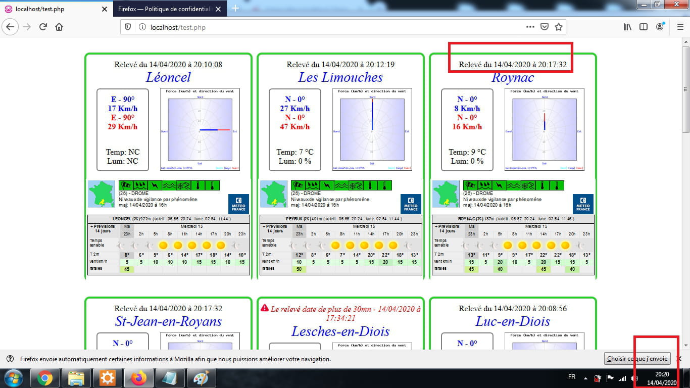
J'ai oublié de te parler d'un problème que j'avais.il y avait un problème de relevé d'heure entre Firefox, Safari et Chromium
J'ai modifié et maintenant ca fonctionne avec Safari et Chromium mais 2 heures de décalage avec Firefox...???
Ancien code:thisData.date = baliseList[i].date == null ? "NC" : new Date(baliseList[i].date.replace(" ","T")).toLocaleString();<code html>
Nouveau code:thisData.date = baliseList[i].date == null ? "NC" : new Date(baliseList[i].date.replace(" ","T")).toLocaleString('fr-FR', { timeZone: 'UTC' });<code html>
donc ce nouveau code indique la mauvaise heure de relevé sur Firefox...!!! mais fonction avec Safari et Chromium???
A quoi correspondent les 3 différents formats? média screen 533px ça je pense que c'est téléphone portable mais quelle différence entre min 1044px et max 1043px?
Encore un immense merci -
Bonjour Anis_web
Tout d'abord un grand merci pour ton super boulôt!!!
J'ai mis la page web sur notre site et ça fonctionne super bien.
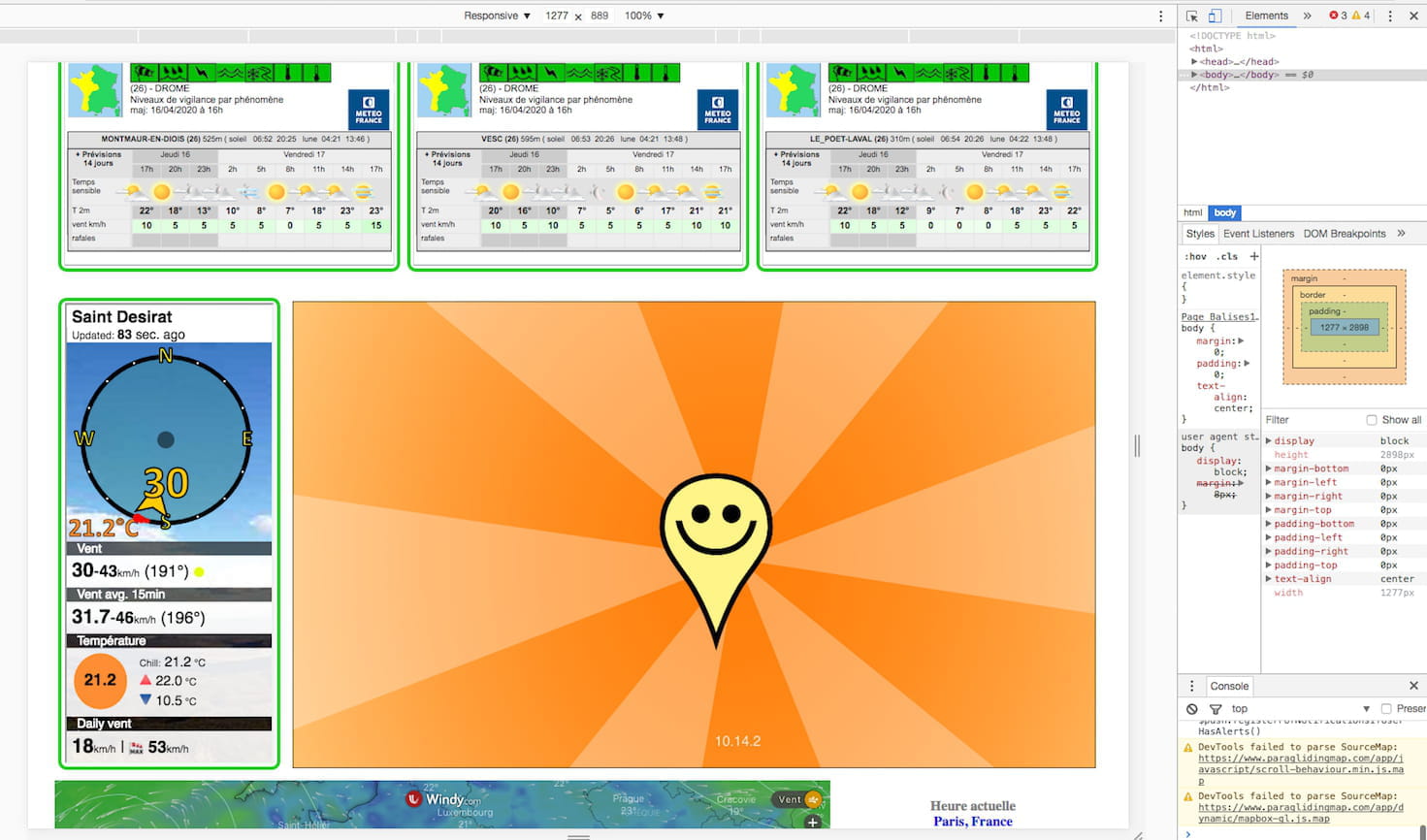
Je suis en train de tester une modification en rajoutant une nouvelle Iframe que j'ai intercalée avant les autres.(class=boxiframe2)
J'ai repris ton code et j'ai crée de nouveau styles.
Je voulais modifier la taille de l'Iframe et faire comme tu avais procédé avec un width:100% et un height:auto avec un scale:1.19 mais l'affichage ne fonctionne pas.
j'ai donc laissé les valeurs d'origine et appliqué le scale:1.19, ca marche en mode plein écran (min-with 1044px) mais avec les modes max-width 1043px et max-width 533px ça bug!!
Si tu as un peu de temps pour jeter un oeil merci...
pas facile le code css et les codes en général!!!
Ton code que j'ai repris et modifié:<style> body { margin: 0; padding: 0; text-align: center; } .red { color: red; } .blue { color: blue; } @media screen and (min-width: 1044px) { #container{ width: 1216px !important; margin: auto; display: table; position:relative; } .box { width: 389px; height: 540px; border: 4px solid rgb(50, 205, 50); border-radius: 10px; padding-bottom: 0px; display: table; margin: 30px 4px 0 4px; float: left; position: relative; } .box > div.right{ width:389px !important; } .box > div.right > a > img{ width: 200px !important; } .box > div.down{ width: 358px !important; position: absolute; bottom: 0; height: 256px; } .boxiframe{ transform: scale(0.9); width: 425px; height: 266px; margin: 0 0 0 -18px; } .date { margin: 10px 0 0 0; font-size: 16px; } .left { width: 140px; height: 200px; border: solid 2px gray; border-radius: 6px; float: left; margin-left: 20px; } .releve { font-size: 14px; } .first { font-size: 20px; margin-top: 20px; } .name { font-size: 28px; margin-bottom: 6px; } .boxslim { width: 250px; height: 540px; border: 4px solid rgb(50, 205, 50); border-radius: 10px; padding-bottom: 0px; display: table; margin: 30px 4px 0 4px; float: left; position: relative; } .innerbox1{ width:1216px; position:relative; display:table; margin:auto; } .innerbox2{ width:1216px; position:relative; display:table; margin:auto; } .box2{ width:930px; position:relative; display:table; float:right; margin: 34px 10px 0 0px; } .box3{ width:900px; position:relative; display:table; float:left; margin:10px 0 0 0; } .box4{ width:300px; position:relative; display:table; float:right; margin:10px 0 0 0; } .boxiframe2{ transform: scale(1.19); width: 200px; height: 445px; margin: 45px 0 0 0; position: relative; } @media screen and (max-width: 1043px) { #container{ width: 100% !important; margin: auto; display: table; position:relative; } .box { width: 500px; height: 579px; border: 4px solid rgb(50, 205, 50); border-radius: 10px; display: table; padding: 20px 4px 0 4px; float: none; position: relative; margin: auto; margin-bottom: 10px; margin-top: 10px; } .box > div.right{ width:500px !important; } .box > div.right > a > img{ width: 178px !important; } .box > div.down{ width: 500px !important; position: absolute; bottom: 0; height: 368px; } .boxiframe{ transform: scale(1.19); width: 425px; height: 266px; margin: 78px 0 0 0; } .date { margin: 0 0 5px 0; font-size: 16px; } .left { width: 181px; height: 180px; border: solid 2px gray; border-radius: 6px; float: left; margin-left: 20px; } .releve { font-size: 14px; } .first { font-size: 20px; margin-top: 10px; } .name { font-size: 35px; margin-bottom: 10px; } .boxslim { width: 250px; height: 540px; border: 4px solid rgb(50, 205, 50); border-radius: 10px; padding-bottom: 0px; display: table; margin: 60px 4px 0 4px; float: left; position: relative; } .innerbox1{ width: 100%; position: relative; display: table; margin: auto; } .innerbox2{ width:100%; position:relative; display:table; margin:auto; } .box2{ width: 512px; position: relative; display: table; float: none; margin: auto; } .box3{ width: 512px; position: relative; display: table; float: none; margin: auto; } .box4{ width: 512px; position: relative; display: table; float: none; margin: auto; } .boxiframe2{ transform: scale(1.19); width: 200px; height: 445px; margin: 130px 0 0 0; } } @media screen and (max-width: 533px) { #container{ width: 100% !important; margin: auto; display: table; position:relative; } .box { width: 325px; height: 465px; border: 4px solid rgb(50, 205, 50); border-radius: 10px; padding-bottom: 0px; display: table; margin: auto; float: none; margin-top:20px; margin-bottom:0px; position: relative;; } .box > div.right{ width:325px !important; } .box > div.right > a > img{ width: 158px !important; } .box > div.down{ width: 325px !important; position: absolute; bottom: 0; height: 234px; } .boxiframe{ transform: scale(0.77); width: 425px; height: 266px; margin: 0 0 0 -50px; } .date { margin: 0 0 0px 0; font-size: 16px; } .left { width: 100px; height: 160px; border: solid 2px gray; border-radius: 6px; float: left; margin-left: 20px; } .releve { font-size: 12px; } .first { font-size: 16px; margin-top: 0px; } .name { font-size: 28px; margin-bottom: 6px; } .boxslim { width: 325px; height: 465px; border: 4px solid rgb(50, 205, 50); border-radius: 10px; padding-bottom: 0px; display: table; margin: auto; float: none; margin-top:20px; margin-bottom:0px; position: relative; } .innerbox1{ width: 100%; position: relative; display: table; margin: 10px 0 0 0; } .innerbox2{ width:100%; position:relative; display:table; margin: 10px 0 0 0; } .box2{ width: 325px; position: relative; display: table; float: none; margin: auto; } .box3{ width: 325px; position: relative; display: table; float: none; margin: auto; } .box4{ width: 325px; position: relative; display: table; float: none; margin: auto; } .boxiframe2{ transform: scale(1.1); width: 200px; height: 266px; margin: 0 0 0 -50px; } } } </style>
et l'Iframe que j'ai rajouté et déplacé le reste...
 <body>

    <div id="container"></div>


    <div class="innerbox1">
        <div class="boxslim">
        <iframe class="boxiframe2" frameborder="1" marginheight="1" marginwidth="1" scrolling="no"  src="https://widget.holfuy.com/?station=1119&su=km/h&t=C&lang=fr&mode=vertical" style="width:200px; height:450;"></iframe>
        </div>
        <div class="box2">
        <iframe src="https://www.paraglidingmap.com/thirdpartywidget.aspx?lat=44.91581&lng=5.31986&zoom=9" style="border: 1px solid black; width: 100%; height: 540px;"></iframe>
        </div>
        <div class="innerbox2">
        <div class="box3">
        <iframe width="100%" height="570" src="https://embed.windy.com/embed2.html?lat=42.066&lon=4.878&zoom=5&level=surface&overlay=wind&menu=&message=true&marker=true&calendar=now&pressure=true&type=map&location=coordinates&detail=true&detailLat=44.927&detailLon=4.893&metricWind=km%2Fh&metricTemp=%C2%B0C&radarRange=-1" frameborder="0"></iframe>
        </div>
        <div class="box4">
        <h4 style="text-align: center"><a href="https://www.zeitverschiebung.net/fr/city/2988507" style="text-decoration:none;"><span style="color:gray;">Heure actuelle</span><br />
                Paris, France</a></h4>
        <iframe frameborder="0" height="90" seamless="" src="https://www.zeitverschiebung.net/clock-widget-iframe-v2?language=fr&size=small&timezone=Europe%2FParis" width="100%"></iframe>
        </div>

        </div>


        <meta http-equiv="Refresh" content="360">
 </body>
le visu du problème sur Chromium:
en plein écran ok:

si je réduis voila le résultat!!!:

Encore un très grand merci pour ce que tu as déjà fait...
Yvan -
Du moment que tu as choisit 1216px comme largeur de container sur PC
le @media screen and (min-width: 1044px) et @media screen and (max-width: 1043px)
doivent aussi changer pour qu'il n'y est pas de décalage comme ci-dessous
donc pour envlever le décalage on remplace la vaeur des deux conditions par :
@media screen and (min-width: 1216px) et @media screen and (max-width: 1215px)
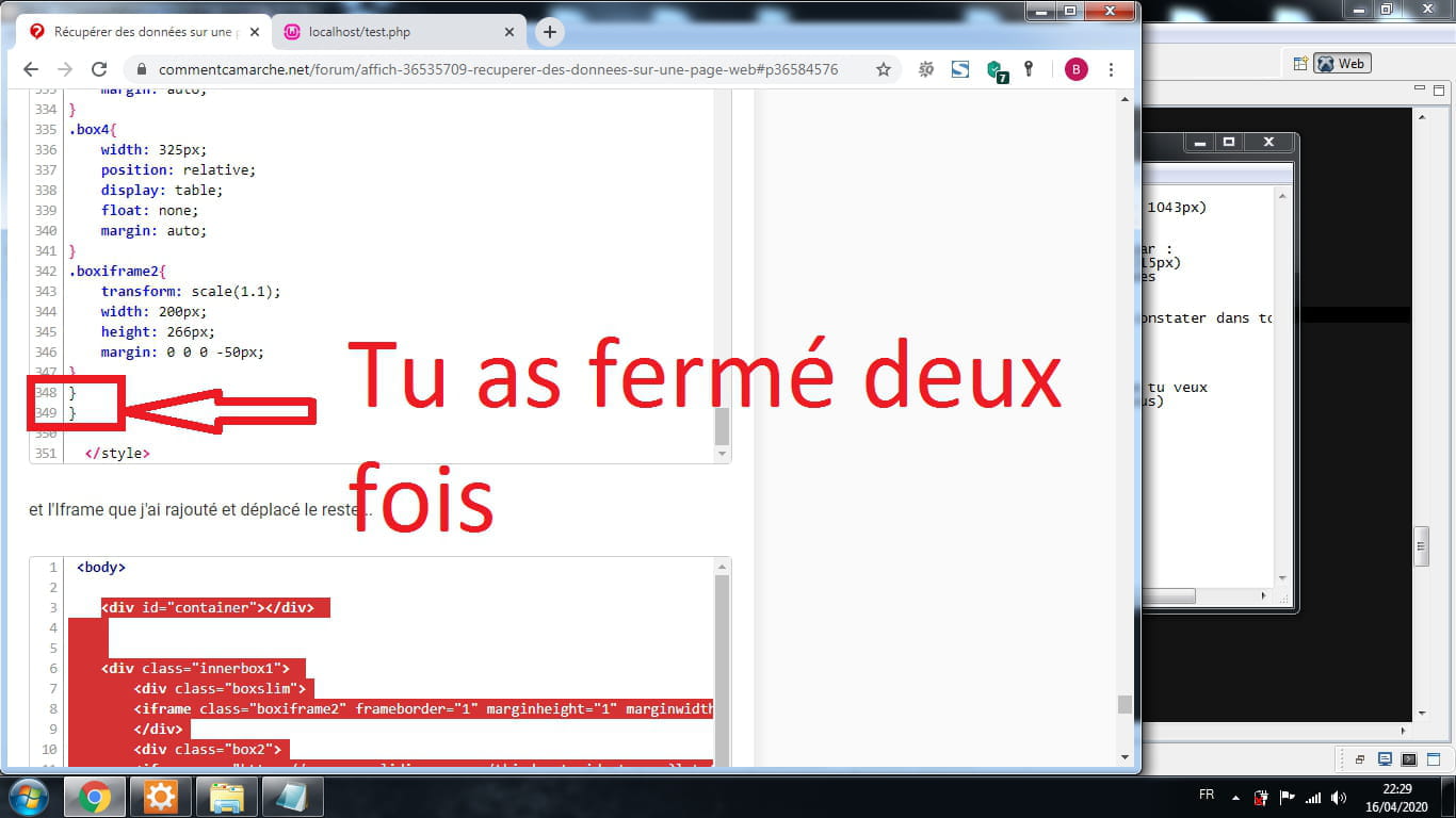
Ensuite tu as fait une erreur dans l'ouverture et la fermeture des acolades
T'as oublié de fermet l'acolade de la première conditions
@media screen and (min-width: 1044px){
il n'y a pas de fermeture en accolade de cette condition si tu as pu le constater dans ton code
et dans la condition @media screen and (max-width: 533px) {
T'as fermé l'accolade deux fois } }
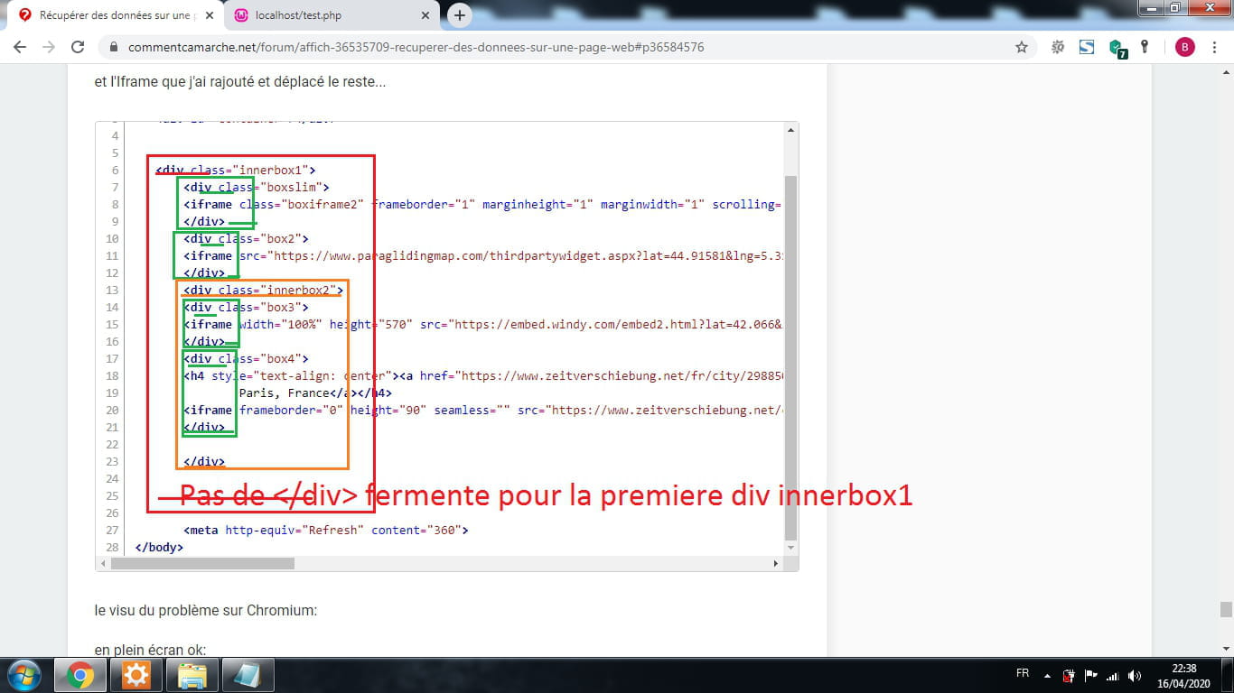
Ensuite il ny'a pas de balise div fermente pour le <div class="innerbox1">
Ce genre d'erreur peut entrainer différents Bugs, on vas nettoyer un peu tout ca
Maintenant je vais corrigé cela et corriger l'affichage de la section que tu veux
Voici la section complète corrigée du code CSS (Code CSS complét ci-dessous)
Code CSS complet :body { margin: 0; padding: 0; text-align: center; } iframe{border:none;} .red { color: red; } .blue { color: blue; } @media screen and (min-width: 1216px) { #container{ width: 1216px !important; margin: auto; display: table; position:relative; } .box { width: 389px; height: 540px; border: 4px solid rgb(50, 205, 50); border-radius: 10px; padding-bottom: 0px; display: table; margin: 30px 4px 0 4px; float: left; position: relative; } .box > div.right{ width:389px !important; } .box > div.right > a > img{ width: 200px !important; } .box > div.down{ width: 358px !important; position: absolute; bottom: 0; height: 256px; } .boxiframe{ transform: scale(0.9); width: 425px; height: 266px; margin: 0 0 0 -18px; } .date { margin: 10px 0 0 0; font-size: 16px; } .left { width: 140px; height: 200px; border: solid 2px gray; border-radius: 6px; float: left; margin-left: 20px; } .releve { font-size: 14px; } .first { font-size: 20px; margin-top: 20px; } .name { font-size: 28px; margin-bottom: 6px; } .boxslim { width: 250px; height: 540px; border: 4px solid rgb(50, 205, 50); border-radius: 10px; padding-bottom: 0px; display: table; margin: 30px 4px 0 4px; float: left; position: relative; } .innerbox1{ width:1216px; position:relative; display:table; margin:auto; } .box2{ width:930px; height:540px; position:relative; display:table; float:right; margin: 34px 10px 0 0px; } .box3{ width:900px; height:574px; position:relative; display:table; float:left; margin:10px 0 0 0; } .box4{ width:300px; position:relative; display:table; float:right; margin:10px 0 0 0; } .boxiframe2{ transform: scale(1.19); width: 200px; height: 445px; margin: 45px 0 0 0; position: relative; } } @media screen and (max-width: 1215px) { #container{ width: 100% !important; margin: auto; display: table; position:relative; } .box { width: 500px; height: 579px; border: 4px solid rgb(50, 205, 50); border-radius: 10px; display: table; padding: 20px 4px 0 4px; float: none; position: relative; margin: auto; margin-bottom: 10px; margin-top: 10px; } .box > div.right{ width:500px !important; } .box > div.right > a > img{ width: 178px !important; } .box > div.down{ width: 500px !important; position: absolute; bottom: 0; height: 368px; } .boxiframe{ transform: scale(1.19); width: 425px; height: 266px; margin: 78px 0 0 0; } .date { margin: 0 0 5px 0; font-size: 16px; } .left { width: 181px; height: 180px; border: solid 2px gray; border-radius: 6px; float: left; margin-left: 20px; } .releve { font-size: 14px; } .first { font-size: 20px; margin-top: 10px; } .name { font-size: 35px; margin-bottom: 10px; } .boxslim { width: 250px; height: 540px; border: 4px solid rgb(50, 205, 50); border-radius: 10px; padding-bottom: 0px; display: table; margin: auto; float: none; position: relative; padding-top:10px; } .innerbox1{ width: 100%; position: relative; display: table; margin: auto; } .box2{ width:500px; height:540px; position:relative; display:table; float:none; margin: auto; padding-top:10px; } .box3{ width: 500px; border: 1px solid #000; height: 574px; position: relative; display: table; float: none; margin: auto; top: 10px; } .box4{ width: 512px; position: relative; display: table; float: none; margin: auto; } .boxiframe2{ transform: scale(1.19); width: 200px; height: 445px; margin: 36px 0 0 0; } } @media screen and (max-width: 533px) { #container{ width: 100% !important; margin: auto; display: table; position:relative; } .box { width: 325px; height: 465px; border: 4px solid rgb(50, 205, 50); border-radius: 10px; padding-bottom: 0px; display: table; margin: auto; float: none; margin-top:20px; margin-bottom:0px; position: relative;; } .box > div.right{ width:325px !important; } .box > div.right > a > img{ width: 158px !important; } .box > div.down{ width: 325px !important; position: absolute; bottom: 0; height: 234px; } .boxiframe{ transform: scale(0.77); width: 425px; height: 266px; margin: 0 0 0 -50px; } .date { margin: 0 0 0px 0; font-size: 16px; } .left { width: 100px; height: 160px; border: solid 2px gray; border-radius: 6px; float: left; margin-left: 20px; } .releve { font-size: 12px; } .first { font-size: 16px; margin-top: 0px; } .name { font-size: 28px; margin-bottom: 6px; } .boxslim { width: 250px; height: 540px; border: 4px solid rgb(50, 205, 50); border-radius: 10px; padding-bottom: 0px; display: table; margin: auto; float: none; position: relative; padding-top:10px; top:10px; } .innerbox2{ width:100%; position:relative; display:table; margin: 10px 0 0 0; } .box2{ width: 325px; position: relative; display: table; float: none; margin: auto; top:10px; } .box3{ width: 325px; height:574px;; position: relative; display: table; float: none; margin: auto; top:20px; } .box4{ width: 325px; position: relative; display: table; float: none; margin: auto; } .boxiframe2{ transform: scale(1.19); width: 200px; height: 446px; margin: 39px 0 0 0; } }
Et voici le code html complet à mettre entre le body
Code html complet :<div id="container"></div> <div class="innerbox1"> <div class="boxslim"> <iframe class="boxiframe2" frameborder="1" marginheight="1" marginwidth="1" scrolling="no" src="https://widget.holfuy.com/?station=1119&su=km/h&t=C&lang=fr&mode=vertical" width="100%" height="auto" ></iframe> </div> <div class="box2"> <iframe src="https://www.paraglidingmap.com/thirdpartywidget.aspx?lat=44.91581&lng=5.31986&zoom=9" width="100%" height="100%" style="border: 1px solid black;"></iframe> </div> </div> <div class="innerbox1"> <div class="box3"> <iframe width="100%" height="100%" src="https://embed.windy.com/embed2.html?lat=42.066&lon=4.878&zoom=5&level=surface&overlay=wind&menu=&message=true&marker=true&calendar=now&pressure=true&type=map&location=coordinates&detail=true&detailLat=44.927&detailLon=4.893&metricWind=km%2Fh&metricTemp=%C2%B0C&radarRange=-1" frameborder="0"></iframe> </div> <div class="box4"> <h4 style="text-align: center"><a href="https://www.zeitverschiebung.net/fr/city/2988507" style="text-decoration:none;"><span style="color:gray;">Heure actuelle</span><br /> Paris, France</a></h4> <iframe frameborder="0" height="90" seamless="" src="https://www.zeitverschiebung.net/clock-widget-iframe-v2?language=fr&size=small&timezone=Europe%2FParis" width="100%"></iframe> </div> </div> <meta http-equiv="Refresh" content="360">
Et dit moi... -
Du moment que tu as choisit 1216px comme largeur de container sur PC
le @media screen and (min-width: 1044px) et @media screen and (max-width: 1043px)
doivent aussi changer pour qu'il n'y est pas de décalage comme ci-dessous
-
donc pour envlever le décalage on remplace la vaeur des deux conditions par :
@media screen and (min-width: 1216px) et @media screen and (max-width: 1215px)
Ensuite tu as fait une erreur dans l'ouverture et la fermeture des acolades
T'as oublié de fermet l'acolade de la première conditions
@media screen and (min-width: 1044px){
il n'y a pas de fermeture en accolade de cette condition si tu as pu le constater dans ton code
-
-
-
Ce genre d'erreur peut entrainer différents Bugs, on vas nettoyer un peu tout ca
Maintenant je vais corrigé cela et corriger l'affichage de la section que tu veux
Voici la section complète corrigée du code CSS (Code CSS complét ci-dessous) -
Code CSS complet :
body {
    margin: 0;
    padding: 0;
    text-align: center;
}
iframe{border:none;}
.red { color: red; }
.blue { color: blue; }
@media screen and (min-width: 1216px) {
#container{
    width: 1216px !important;
    margin: auto;
    display: table;
    position:relative;
}
.box {
    width: 389px;
    height: 540px;
    border: 4px solid rgb(50, 205, 50);
    border-radius: 10px;
    padding-bottom: 0px;
    display: table;
    margin: 30px 4px 0 4px;
    float: left;
    position: relative;
}
.box > div.right{
    width:389px !important;
}
.box > div.right > a > img{
    width: 200px !important;
}
.box > div.down{
    width: 358px !important;
    position: absolute;
    bottom: 0;
    height: 256px;
}
.boxiframe{
    transform: scale(0.9);
    width: 425px;
    height: 266px;
    margin: 0 0 0 -18px;
}
.date {
    margin: 10px 0 0 0;
    font-size: 16px;
}
.left {
    width: 140px;
    height: 200px;
    border: solid 2px gray;
    border-radius: 6px;
    float: left;
    margin-left: 20px;
}
.releve {
    font-size: 14px;
   }
.first {
    font-size: 20px;
    margin-top: 20px;
}
.name {
    font-size: 28px;
    margin-bottom: 6px;
}
.boxslim {
    width: 250px;
    height: 540px;
    border: 4px solid rgb(50, 205, 50);
    border-radius: 10px;
    padding-bottom: 0px;
    display: table;
    margin: 30px 4px 0 4px;
    float: left;
    position: relative;
}
.innerbox1{
    width:1216px;
    position:relative;
    display:table;
    margin:auto;
}
.box2{
    width:930px;
    height:540px;
    position:relative;
    display:table;
    float:right;
    margin: 34px 10px 0 0px;
}
.box3{
    width:900px;
    height:574px;
    position:relative;
    display:table;
    float:left;
    margin:10px 0 0 0;
}
.box4{
    width:300px;
    position:relative;
    display:table;
    float:right;
    margin:10px 0 0 0;
}
.boxiframe2{
    transform: scale(1.19);
    width: 200px;
    height: 445px;
    margin: 45px 0 0 0;
    position: relative;
}
}
@media screen and (max-width: 1215px) {
    #container{
    width: 100% !important;
    margin: auto;
    display: table;
    position:relative;
}
.box {
    width: 500px;
    height: 579px;
    border: 4px solid rgb(50, 205, 50);
    border-radius: 10px;
    display: table;
    padding: 20px 4px 0 4px;
    float: none;
    position: relative;
    margin: auto;
    margin-bottom: 10px;
    margin-top: 10px;
}
.box > div.right{
    width:500px !important;
}
.box > div.right > a > img{
    width: 178px !important;
}
.box > div.down{
    width: 500px !important;
    position: absolute;
    bottom: 0;
    height: 368px;
}
.boxiframe{
    transform: scale(1.19);
    width: 425px;
    height: 266px;
    margin: 78px 0 0 0;
}
.date {
    margin: 0 0 5px 0;
    font-size: 16px;
}
.left {
    width: 181px;
    height: 180px;
    border: solid 2px gray;
    border-radius: 6px;
    float: left;
    margin-left: 20px;
}
.releve {
    font-size: 14px;
   }
.first {
    font-size: 20px;
    margin-top: 10px;
}
.name {
    font-size: 35px;
    margin-bottom: 10px;
}
.boxslim {
    width: 250px;
    height: 540px;
    border: 4px solid rgb(50, 205, 50);
    border-radius: 10px;
    padding-bottom: 0px;
    display: table;
    margin: auto;
    float: none;
    position: relative;
    padding-top:10px;
}
.innerbox1{
    width: 100%;
    position: relative;
    display: table;
    margin: auto;

}
.box2{
    width:500px;
    height:540px;
    position:relative;
    display:table;
    float:none;
    margin: auto;
    padding-top:10px;
}
.box3{
	width: 500px;
    border: 1px solid #000;
    height: 574px;
    position: relative;
    display: table;
    float: none;
    margin: auto;
    top: 10px;
}
.box4{
    width: 512px;
    position: relative;
    display: table;
    float: none;
    margin: auto;
}
.boxiframe2{
    transform: scale(1.19);
    width: 200px;
    height: 445px;
    margin: 36px 0 0 0;
}
}
@media screen and (max-width: 533px) {
    #container{
    width: 100% !important;
    margin: auto;
    display: table;
    position:relative;
}
.box {
    width: 325px;
    height: 465px;
    border: 4px solid rgb(50, 205, 50);
    border-radius: 10px;
    padding-bottom: 0px;
    display: table;
    margin: auto;
    float: none;
    margin-top:20px;
    margin-bottom:0px;
    position: relative;;
}
.box > div.right{
    width:325px !important;
}
.box > div.right > a > img{
    width: 158px !important;
}
.box > div.down{
    width: 325px !important;
    position: absolute;
    bottom: 0;
    height: 234px;
}
.boxiframe{
    transform: scale(0.77);
    width: 425px;
    height: 266px;
    margin: 0 0 0 -50px;
}
.date {
    margin: 0 0 0px 0;
    font-size: 16px;
}
.left {
    width: 100px;
    height: 160px;
    border: solid 2px gray;
    border-radius: 6px;
    float: left;
    margin-left: 20px;
}
.releve {
    font-size: 12px;
   }
.first {
    font-size: 16px;
    margin-top: 0px;
}
.name {
    font-size: 28px;
    margin-bottom: 6px;
}
.boxslim {
    width: 250px;
    height: 540px;
    border: 4px solid rgb(50, 205, 50);
    border-radius: 10px;
    padding-bottom: 0px;
    display: table;
    margin: auto;
    float: none;
    position: relative;
    padding-top:10px;
    top:10px;
}
.innerbox2{
    width:100%;
    position:relative;
    display:table;
    margin: 10px 0 0 0;
}
.box2{
    width: 325px;
    position: relative;
    display: table;
    float: none;
    margin: auto;
    top:10px;
}
.box3{
    width: 325px;
    height:574px;;
    position: relative;
    display: table;
    float: none;
    margin: auto;
    top:20px;
}
.box4{
    width: 325px;
    position: relative;
    display: table;
    float: none;
    margin: auto;
}
.boxiframe2{
    transform: scale(1.19);
    width: 200px;
    height: 446px;
    margin: 39px 0 0 0;
}
}
-
-
Bonjour,
En effet des erreurs et des choses mal encodés de ma part...
Quand on débute, c'est compliqué.
Je viens de voir un bug dans l'affichage, en mode plein écran:OK, en mode plus petite taille:OK
par contre en mode intermédiaire les formats des box (.box) présentent des problèmes d'affichage
Sur mon téléphone en mode portrait:OK, mais en mode paysage, problème d'affichage:
Vue avec Chromium ou Safari:
Vue depuis le téléphone:
lien vers notre page web:https://www.tichodromes.com/pages/balises/
Merci et bonne journée


- 1
- 2
Suivant
