Fade effect of 2 elements in indesign
eau18
Posted messages
118
Status
Member
-
eau18 Posted messages 118 Status Member -
eau18 Posted messages 118 Status Member -
Hello,
I would like to create a fade effect between two photos so that they overlap perfectly, without a white line appearing between them, or something even uglier like in the image here
https://drive.google.com/open?id=0B4IeKGP1mj2aWjlkVEYwVEFjNWM
Could someone please help me?
Thank you very much in advance!
I would like to create a fade effect between two photos so that they overlap perfectly, without a white line appearing between them, or something even uglier like in the image here
https://drive.google.com/open?id=0B4IeKGP1mj2aWjlkVEYwVEFjNWM
Could someone please help me?
Thank you very much in advance!
2 answers
-
You can use the "Gradient Feather" tool to soften the edge of each photo before overlaying them in InDesign...
But this won't replace localized editing in an image editing software with tuning of the alignment...
And of course, the images must be suitable for this, or you'll have to create connection elements and redo the overall color scheme. -
Quickly done with Photoshop, it can look like this!
And it's not great...
But it all depends on the final use!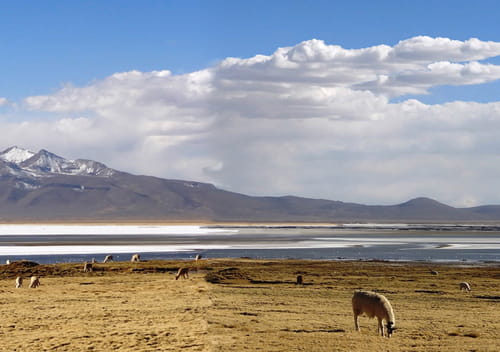
-
Thank you very much Cirelot, it's perfect like this. Could you please tell me which tools you used on Photoshop? Thank you very much.
- ok, this might be a bit complex for a novice on Photoshop...
But let's give it a try:
1) Preparation: Open the file in Photoshop and create 2 new layers (transparent background). Separate the two parts of the photo. Put each one on its own layer. Shift the two parts of the photo to leave a space of 1 to 5 pixels between them. For this, we mostly work on the right part. Try to balance the color tones on the right side (which I didn't do... :) ) roughly... to facilitate the junctions (rectangular selection tool or ctrl a).
2) Aligning elements: in your example, the elements are not facing each other. They need to be.
- The clouds: For these, using the (magic wand) tool with a tolerance of 10-20, select all the clouds from the right side and duplicate them upwards to be in front of those on the left.
- The beach (just below the mountain) do the same, align it with the left part both at the top and bottom (rectangular selection tool with a feathered edge) by duplicating a small strip the length of the right part.
- The arm of the sea at the top: we will see later.
- The arm of the sea at the bottom: select (rectangular selection tool) from the lowest white part down to the bottom of the photo (land). Duplicate the whole so that the two white strips are aligned.
From there, all your elements are aligned with the right part except for a piece of sea in the middle.
Select the two layers and merge them.
3) Creating texture: since you have separated the 2 parts between them, we need to recreate some texture. For this, we will use the clone stamp tool with a variable "blur" thickness of 5px to 30px depending on the areas, all combined with a selection with mostly a feathered edge.
- Example for the sky: create a selection with the (magic wand) or (lasso) at the level of the separation of the 2 parts wider (that overflows largely on one side as well as the other) with a feathered edge (e.g.: 10-20), then with the clone stamp tool fill the transparent part. Once done, select the entire sky (left and right) and with a light directional blur the junction should no longer be visible... if needed use the smudge tool (not highly recommended) or the brightness+ and brightness- tools to achieve a tonal balance between the two parts.
- Same manipulation (except for the directional blur) for the clouds, the hill, the sea, and the land using the clone stamp tool within a selection with feathered edge + brightness+ and - to balance the tones.
Don't forget to save the psd regularly
As we are experimenting at certain moments, feel free to use the history to revert to a better rendering.
There you go, I hope I was clear enough...
Time for a skilled person: 1 to 2 hours for a rendering like the above.
-
-